Chart cleanup
Anna E. submitted this great example from Yahoo! Green. A well-meaning chart but stuffed with redundancy.

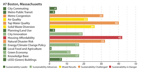
Much appear to be going on and yet the entire chart contains 15 data points, Boston's ranks on each of 15 categories. The bar lengths convey the same information as the data labels. The legend provides a catchy name for different levels of ranks (0-10 = "leader"; 10-20 = "advances"; etc.). The colors merely reiterate the catchy titles. Similarly, the colored squares repeat the information in the bars.
In the name of green, we cleaned up this chart:

As a standalone graph, the categories should be ordered by Boston's ranks. Here, we assume that cross-referencing cities is needed so we leave the order unchanged.


