Clear and confused states
What does pink mean on this map?
Long-time contributor Howard H. appreciates this data visualization project in the Washington Post about the emergency preparedness of counties in southern states as floods and hurricanes pound the region. (link)
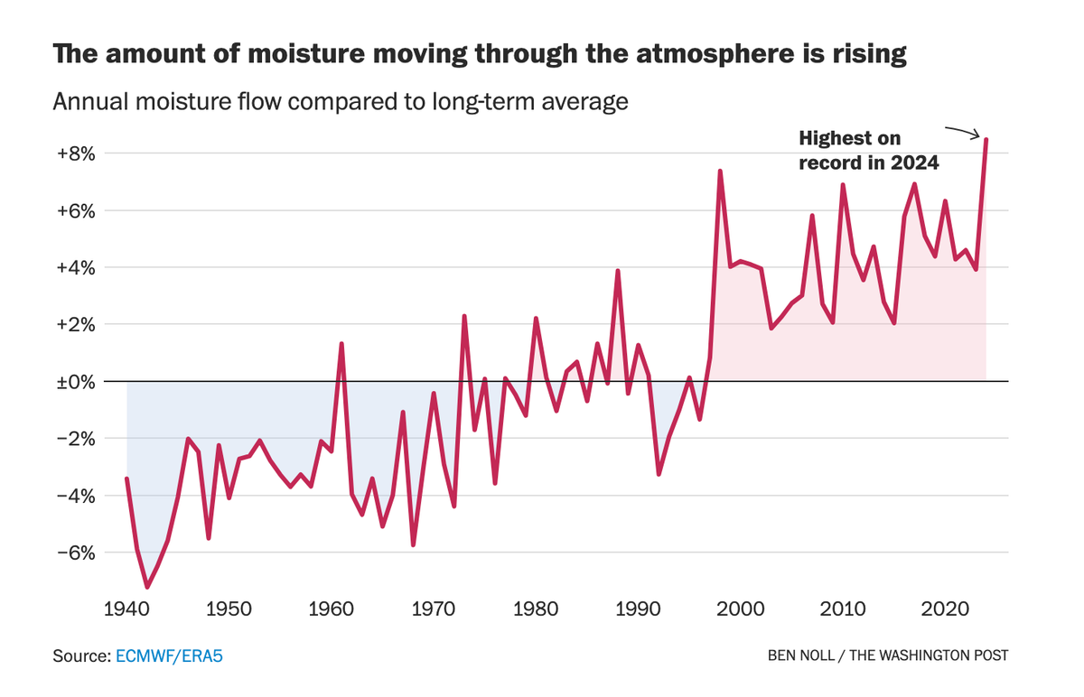
He and I both like the first graph:

When the trend is clear, the graph does not need more embellishment.
Howard said: "Great title, clear visual, nice annotation to drive the point home. The pink/blue shading isn’t strictly 'Tuftian,' but it emphasizes the chart’s main message, so while it’s a little extra I think I like it."
There are two minor visual issues:
- I'd have drawn the line in gray so it doesn't get associated with just the red shaded area.
- Also, I'd have extended the negative side of the vertical axis to -8% so that the top and bottom halves have equal heights.
***
The second chart in the series perplexes us both.

Howard is concerned about the story behind the map. Why did more residents evacuate in the green counties?
I'm confused about what the pink part of the data encodes. In the legend labeling, pink represents counties in which "more [people] are staying in the storm's path". The legend's title suggests a comparison of the current week to "a normal week".
They have obtained cell phone data that tracked people's movements. For each county, let's assume they are able to compute both the in-flow and the out-flow of people in any given week. They define something called the "normal week": we assume this to mean the average week for some historical period of time. So for each county, they have the average in and average out. They also have the current week's in and out.
This is where things get murky. We are comparing the current week to the normal week. Because the in and out metrics are separate counts, they can go in opposite directions. If so, the data could not be tamed by a one-dimensional color scale.
Maybe they don't track in- and out-flows separately, combining the two metrics to yield the net flow, defined as out minus in. Given the direction I've chosen, let's call it the net outflow.
If the net outflow is 0%, that means the same volume of movement was observed in the current week relative to normal. Notice that this does not mean the volume of in-flow equals the volume of out-flow. For example, if a net of 10,000 people move out of a county in a normal week, then a net outflow of 0% represents 10,000 people leaving the county in the current week. To make this point clearer, let's rename the metric the relative net outflow.
If the relative net outflow is a positive percentage, that means relatively more people moved out of the county during the current week than normal. If normally there is a net outflow, then the current week's net outflow is even larger. If normally there is a net inflow, then the current week's net inflow is smaller, or it could even flip from net in to net out.
In the color legend, positive relative net outflow is shown in green and described as "more [people] leaving storm's path [than in a normal week]".
The pink part is described as "more [people] staying in the storm's path [than in a normal week]". This section of the scale corresponds to a negative relative net outflow, i.e. relatively fewer people than usual moved out of the county during the current week. In the first case, if normally there is a net outflow, then the current week's net outflow is smaller. To me, this is unexpected. If the county's residents choose to ignore the potential storms, they'd have gone on their business as usual, and I'd have expected the relative net outflow to stay within the normal range, rather than moving in a negative direction.
In the second case, if normally there is a net inflow, then the current week's net inflow is larger. This is counterintuitive in the same way. Could it be the case that residents from other counties who are evacuating decide to move to these counties?
In my discussion with Howard, we both feel that most counties probably experience neutral movements over a period of time, i.e. average net outflow is close to zero. This assumption doesn't help with the interpretation; it just suggests that the comparison to the "normal week" is a moot point.
***
Howard brings up an alternative scaling scheme: compute the evacuation rates of all counties, take the average evacuation rate as the midpoint, so that the scale represents a specific county's evacuation rate relative to the average county.
Since the map directly references a "normal week", it's probably not what they did.


