Coffee in different shapes and sizes: a test of self-sufficiency
You'd need more coffee to read this chart
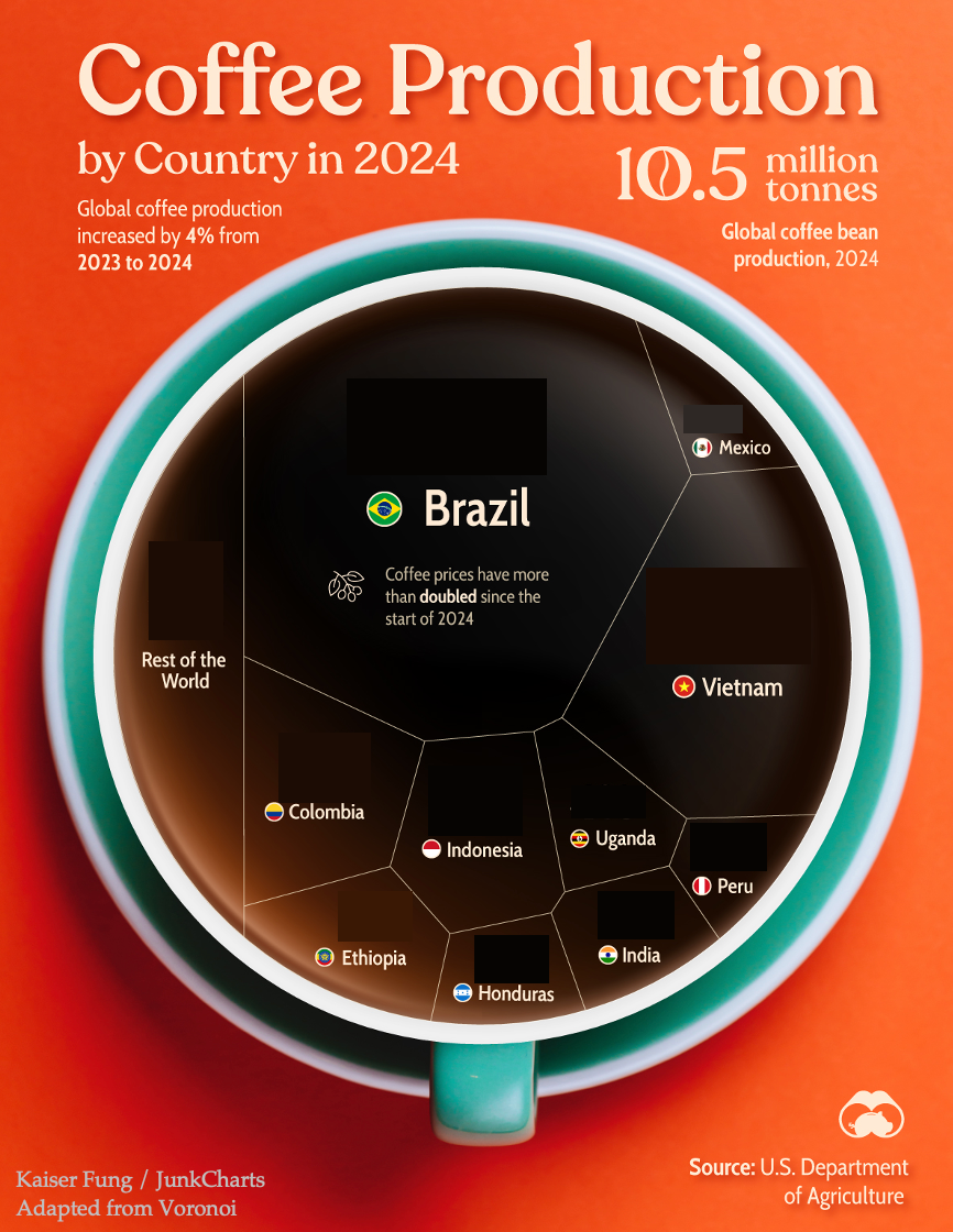
Take a look at the following graphic showing top producers of coffee in 2o24:

Then, try the following tasks:
- Which country is the top producer?
- What proportion of the world's production does the top country make?
- Which countries form the top three?
- How much is the "Rest of the World" compared to Brazil?
- How many countries account for the top 50% of the world's production?
- Does Indonesia or Columbia produce more coffee?
- Compare India and Uganda
- How about Honduras vs Peru?
I finished two cups of coffee and still couldn't answer most of these questions. How about you?
***
Now, let's look at the original chart, published by Voronoi, and sent to me by a long-time reader:

Try those questions again, and the answers seem much more available.
How so?
What we've just demonstrated is that when the reader takes information from this graphic, the reader is consuming the data labels, while the visual encoding of data to shapes has offered zero help.
Given this finding, replacing the above chart with a data table would have achieved the same result, if not expediting understanding.
***
I'm using this graphic to illustrate my "self-sufficiency" test: by removing all data labels from the chart, we reveal how much work the visual elements are doing to enable understanding of the message and the underlying data.
***
Now, our long-time reader has a few comments, with which I agree:
- what they did right: avoided the "let's just use a choropleth trap"
- what went wrong? a) using shapes you can't compare at a glance
- what went wrong? b) no color difference between the shapes
- what went wrong? c) it looks like larger values are on top, except for Mexico which is squeezed up top for some reason


