Divided nation
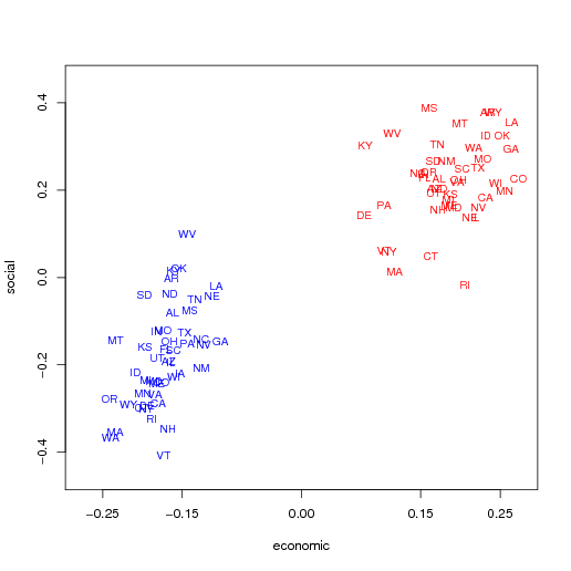
Professor Gelman generally believes the red state, blue state paradigm is too simplistic to describe the American electorate. He has been sharing some of his work on his blog, and has just published a book about this topic. Recently he produced the following chart, which is gimmick-looking but crystal clear in its message.

Here, economic and social ideology are plotted on a scatter chart, with positive values indicating conservatism and negative values liberalism. Further, each state is represented twice on the chart, the red point for the Republicans and the blue for Democrats within the state.
This is a cluster analyst's dream data set. The absolute separation of the Republican cluster and the Democrat cluster is astounding: imagine a diagonal line perfectly classifying all points.
We should not miss a host of details:
- as Andrew pointed out, "the big thing we see from the graph ... is that Democrats are much more liberal than Republicans on the economic dimension: Democrats in the most conservative states are still much more liberal than Republicans in even the most liberal states." This is clear from the wide gap on the horizontal axis.
- there is a small degree of overlap on the social ideology axis so the nation is closer together on that front.
- but wait a minute, the scale on the social axis is not the same as that on the economic axis. This means that the extremes are more extreme on the social axis: the difference between MS and VT is roughly 0.8 on the social scale while the largest difference on the economic scale is roughly 0.5. (here, I am assuming that the scales are comparable to each other)
- there is high correlation between social and economic ideologies: the points are well-aligned along the 45-degree line
- especially on social issues, the Democrats are divided within (the elongated shape of the blue cluster).
Reference: Gelman, "Ranking states by conservatism/liberalism of their voters", June 30 2008.


