Don't show everything
Plotting lots of data but conveying not much information
There are many examples where one should not show everything when visualizing data.
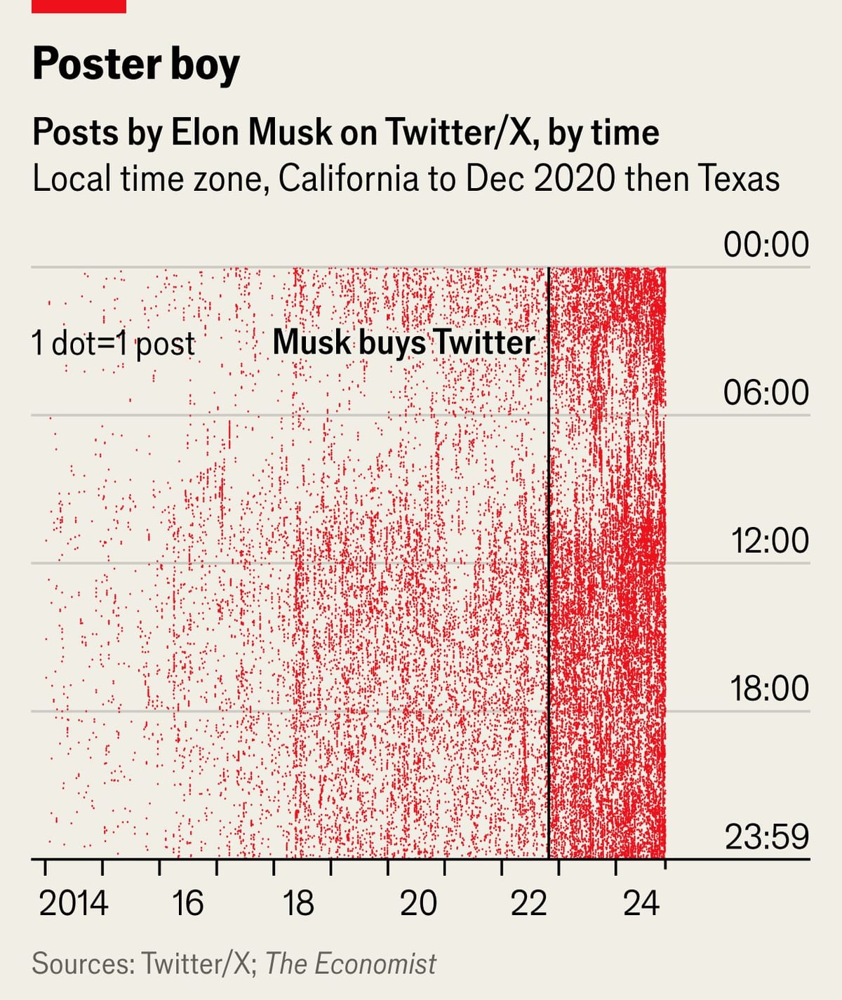
A long-time reader sent me this chart from the Economist, published around Thanksgiving last year:

It's a scatter plot with each dot representing a single tweet by Elon Musk against a grid of years (on the horizontal axis) and time of day (on the vertical axis).
The easy messages to pick up include:
- the increase in frequency of tweets over the years
- especially, the jump in density after Musk bought Twitter in late 2022 (there is also a less obvious level up around 2018)
- the almost continuous tweeting throughout 24 hours.
By contrast, it's hard if not impossible to learn the following:
- how many tweets did he make on average or in total per year, per day, per hour?
- the density of tweets for any single period of time (i.e., a reference for everything else)
- the growth rate over time, especially the magnitude of the jumps
The paradox: a chart that is data-dense but information-poor.
***
The designer added gridlines and axis labels to help structure our reading. Specifically, we're cued to separate the 24 hours into four 6-hour chunks. We're also expected to divide the years into two groups (pre- and post- the Musk acquisition), and secondarily, into one-year intervals.
If we accept this analytical frame, then we can divide time into these boxes, and then compute summary statistics within each box, and present those values. I'm working on some concepts, will show them next time.


