Election spinner
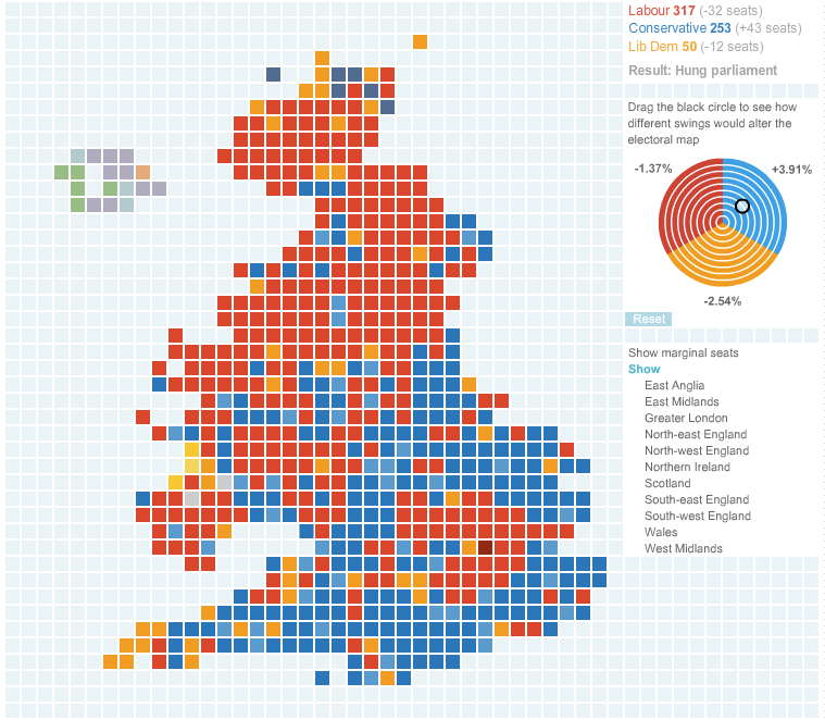
Bernard L. sent in this chart a while ago, and with the looming British elections, it's a good time to show it, and ask readers how to spin this election. (Via Guardian)

In particular, could someone help me understand the tri-color spinner? Given that the change in seats for the three parties combined should be zero, I don't get how this can fit into a concentric-circles presentation. If you click on the link to the original chart, you can move the black dot around the circle.
In addition, I'm mystified why the constituencies can be depicted on a graph paper, each one the same size as the other. This is not the first time I have seen the U.K. mapped in this way so there must be some reason behind this choice. (For reference, I have never seen the 50 states mapped in this fashion.)
Reference: "Election Map and Swingometer 2010", Guardian (UK), April 5 2010.


