Four reasons to unplug radar charts
Ouch, ouch, ouch, ouch
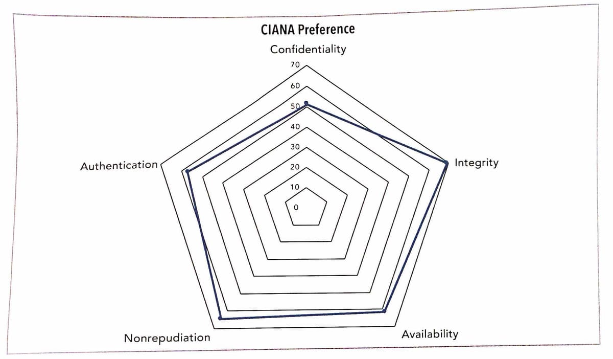
I remain unconvinced by radar charts. Here is another example that popped up in a recent issue of ORMS Today (link).
Some entity is being rated on five dimensions. These dimensions are laid out as five spokes from the center, equally spaced. The ratings appear as five dots on these spokes. The five dots are connected cyclically to form a sequence, using straight line segments.
This use of the radar chart is very popular on business dashboards. The purpose is to rate entities along multiple dimensions. When multiple entities are rated, they each appear as a cyclical sequence.
In this post, I present five reasons why you should stay away from the radar chart.
- The Radar chart foregrounds fake connections.
In the example above, the reader's attention is focused on the thick blue line. Perhaps its jagged shape carries the key to unlocking the insights in the dataset. (Perhaps not.) In other examples, the designer shades the area enclosed by the connected line segments. The area has no more relevance than the shape.
The data are actually encoded in the distances between the center and the dots on the spokes. Ironically, the radial lines are backgrounded in favor of the envelope.
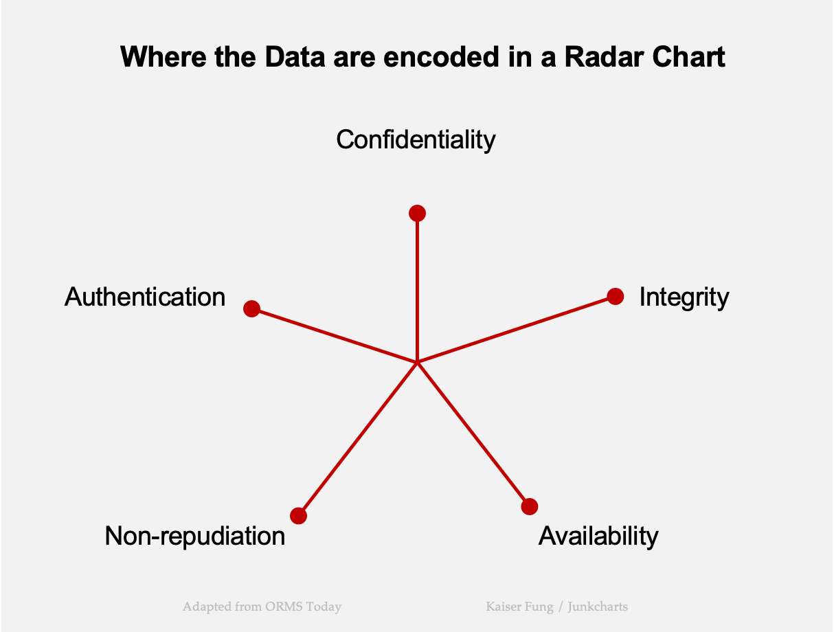
If someone wants to understand the chart, they have to backfill these red lines while ignoring the blue envelope.
You might think of salvaging the radar chart by plotting those radial lines instead of the envelope. There is a reason why this isn't the common practice: the radial design of the radar chart is severely limited in scope. Imagine trying to compare two entities on those five dimensions. The radial axes overlap, messing up the comparison.
- The Radar chart conveys fake neutrality.
Like all chart forms, the radar chart imposes a set of strict assumptions on the designer. Many of these assumptions are impractical, even harmful. One such restriction is the equal spacing between the spokes, which implies equal importance between the dimensions.