From bad to worse
Pie charts can range from bad to worse. Brent L. pointed us to a few on the right end of that spectrum.

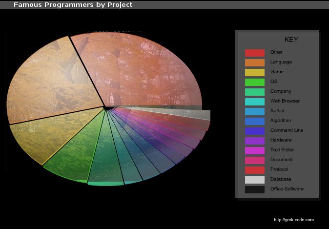
Brent wrote: "The background image makes it almost totally unreadable. And what does the forest scene have to do with programming? *sigh*"
That's not to mention the oval rather than circle, the dizzling array of colors, the Excel-style legend that inverts the order of importance ("Other" at the top), etc. etc.
Again, a column chart would have been much clearer. Since the total number of famous programmers is arbitrary, a chart of counts would work at least as well as one that plots proportions.
More here.
Reference: "Famous programmers from Adleman to Zimmerman", grokcode.


