Joining the fun

We hope this is indication that the British paper Guardian (with one of the best websites out there) is joining the fun. It appears that they have quietly debuted an interactive graphics feature. The first edition addressed the oil price crisis.
This time-series chart has much to be commended:
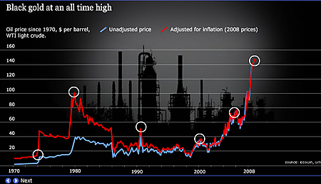
The use of inflation-adjusted figures seems obvious but we don't see much of these in the press. Highlighting the peaks and providing annotation (when moused over) is an excellent touch. The gridlines and axis labels (especially the year axis) are thankfully restrained. We don't see the need for the unadjusted series (blue line), however. The fact that the gap grew larger the more time we went back told us little, as it invited readers to read into it more than what it truly was, the time value of money.
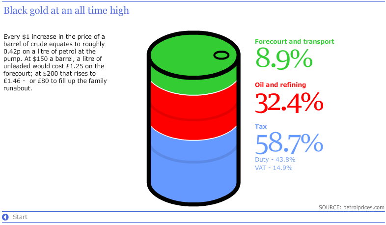
Later on, they used an oil barrel object to illustrate the components of retail oil price. The height of the cylinder is indeed proportional to the data plotted. If only they colored the end of the cylinder gray instead of green! As it stands, the green portion has about the same area as the red.
Reference: "Interactive: oil price", Guardian, July 14 2008.


