Loss aversion

Loss aversion manifests itself in chart-making, as it does in economics. In chart-marking, loss aversion can be defined as the tendency to avoid losing data at any cost. Given a rich data set, designers often make the mistake of cramming as much data into the chart as possible. This is taking Tufte's concept of maximizing data-ink ratio to the extreme, and it often leads to awkward, muddled charts.
Gelman provided a great example of this recently. See here.
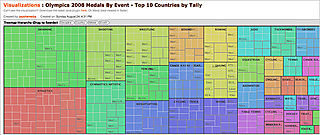
Every piece of data is given equal footing, which results in nothing standing out. The reader gasps for air.
Here is a recent example from the New York Times, in which the designer showed admirable restraint.

The best evidence is the set of small multiples shown at the bottom. These give the amount of phosphorus flowing into the lake annually since 1973, as measured from four locations.
The point is that the pollution has been most serious on the northern shores, especially in recent years. Thus, the Florida plan focusing on the southern region is likely to make limited impact.
The choice of vertical lines is smart, as the typical time-series connected-line chart would jump up and down crazily. A simple vertical axis marks the amounts, avoiding the temptation to print all the data. The designer realizes it is the trend, rather than individual values, that is the issue.
Taken together, the three components tell a good story. This is a well-executed effort. The Times once again proves itself the leader in developing sophisticated graphics.
Reference: "Florida Deal for Everglades May Help Big Sugar", New York Times, Sep 13 2008.


