Making charts beautiful without adding unneeded bits
What is the message?
Reader Dave S. sent me to some very pretty pictures, published in Wired.

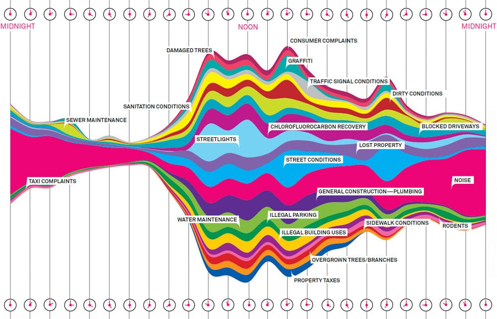
This chart, which shows the distribution of types of 311 calls in New York City by hour of day, is tops in aesthetics. Rarely have I seen a prettier chart.
***
The problem: no insights.
When you look at this chart, what message are you catching? Furthermore, what message are you catching that is informative, that is, not obvious?
The fact that there are few complaints in the wee hours is obvious.
The fact that "noise" complaints dominate in the night-time hours is obvious.
The fact that complaints about "street lights" happen during the day is obvious.
There are a few not-so-obvious features: that few people call about rodents is surprising; that "chlorofluorocarbon recovery" is a relatively frequent source of complaint is surprising (what is it anyway?); that people call to complain about "property taxes" is surprising; that few moan about taxi drivers is surprising.
But - in all these cases, there are no interesting intraday patterns, and so there is no need to show the time-of-day dimension. The message can be made more striking doing away with the time-of-day dimension.
The challenge to the "artistic school" of charting is whether they can make clear charts look appetizing without adding extraneous details.