One doesn't have to plot raw data
Kaiser looks at gold production worldwide.
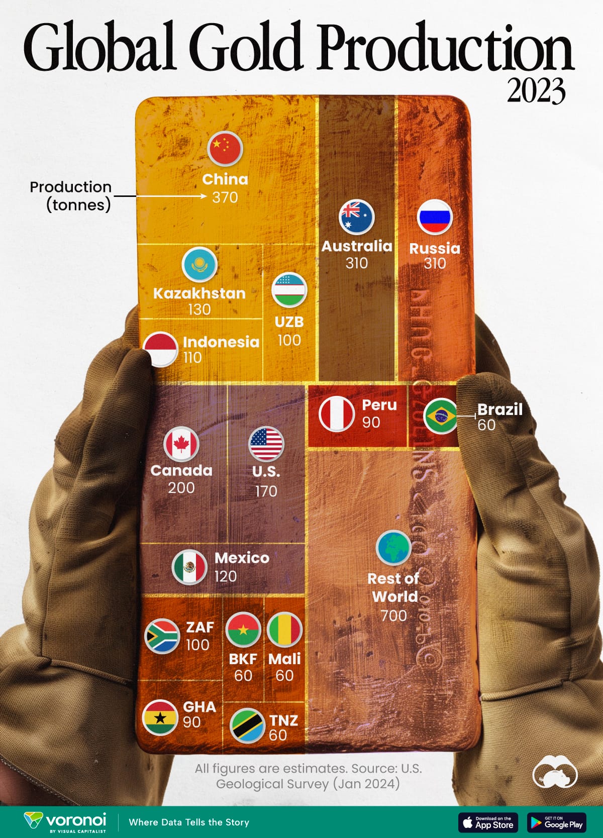
Visual Capitalist chose a treemap to show us where gold is produced (link):

The treemap is embedded into a brick of gold. Any treemap is difficult to read, mostly because some block are vertical, others horizontal. A rough understanding is nevertheless possible: the entire global production can be roughly divided into four parts: China plus three other Asian producers account for roughly (not quite) a quarter; "rest of the world" (i.e. all countries not individually listed) is a quarter; Russia and Australia together is again a bit less than a quarter.
***
When I look at datasets that rank countries by some metric, I'm hoping to present insights, rather than the raw data. Insights typically involve comparing countries, or sets of countries, or one country against a set of countries. So, I made the following chart that includes some of these insights I found in the gold production dataset:

For example, the top 4 producers in Asia account for almost a quarter of the world's output; Canada, U.S. and Australia together also roughly produce a quarter; the rest of the world has a similar output. In Asia, China's output is about the sum of the next 3 producers, which is about the same as U.S. and Canada, which is about the same as the top 5 in Africa.