Pie charts and self-sufficiency
A series of pie charts is used to demonstrate a trend
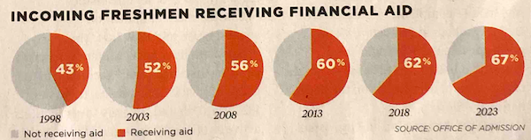
This graphic shows up in a recent issue of Princeton alumni magazine, which has a series of pie charts.

The story being depicted is clear: the school has been generously increasing the amount of financial aid given to students since 1998. The proportion receiving any aid went from 43% to 67% so about two out of three students who enrolled in 2023 are getting aid.
The key components of the story are the values in 1998 and 2023, and the growth trend over this period.
***
Here is an exercise worth doing. Think about how you figured out the story components.
Is it this?

Or is it this?

***
This is what I've been calling a "self-sufficiency test" (link). How much work are the visual elements doing in conveying the graph's message to you? If the visual elements aren't doing much, then the designer hasn't taken advantage of the visual medium.