Return this plate, I want my pie chart
Reader Brad E. reminds me about the USDA's attempt to "improve" the visual presentation of dietary standards. As reported here, the food pyramid failed its mission and is retired. Here comes MyPlate!

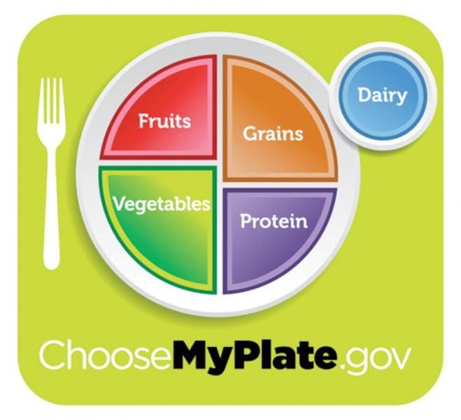
According to this report, the government wants to impart these key points:
- MyPlate offers a visual reminder to make healthy food choices when you choose your next meal.
- It can help prioritize food choices and remind us to make fruits and vegetables half of our plates each meal.
- On the other side of the plate – and beside it – we see the other important food groups for a healthy meal: whole grains, lean proteins, and low fat dairy.
We have been warned not to think of this as a pie chart.
What do we call a circular chart in which the area of the circle is partitioned into separate regions?
***
How does one say return MyPlate to the kitchen fast enough? The biggest problem here is that the key points are out of sync with the chart details. The MyPlate diet, as depicted, has less than the recommended amounts of fruits and vegetables! Since those two important food groups only equal grains and proteins, the presence of dairy means that fruits and vegetables form less than half of this diet.
The core message is that one should split one's diet in half, with fruits and veggies on the one side and grains, proteins and dairy on the other. If this is so, the following chart gets this point across with minimal probability of confusion:

If, on the other hand, the above chart is deemed too simple, and the message really does require proportions of each of the five food categories, then the sad truth is that a pie chart would have conveyed the message better.

MyPlate serves up strange portions that cannot be properly sized. How big is the "dairy" circle compared to any of the quadrants? How does one judge the irregularly-sized quadrants (grains and vegetables)? If there is any use for the pie chart, it is to display simple concepts with limited dimensions.


