Serving donuts
David Leonhardt's article on the graduation rates of public universities caught my attention for both graphical and statistical reasons.

David gave a partial review of a new book "Crossing The Finish Line", focusing on their conclusion that public universities must improve their 4-year graduation rates in order for education in the U.S. to achieve progress. This conclusion was arrived at through statistical analysis of detailed longitudinal data (collected since 1999).
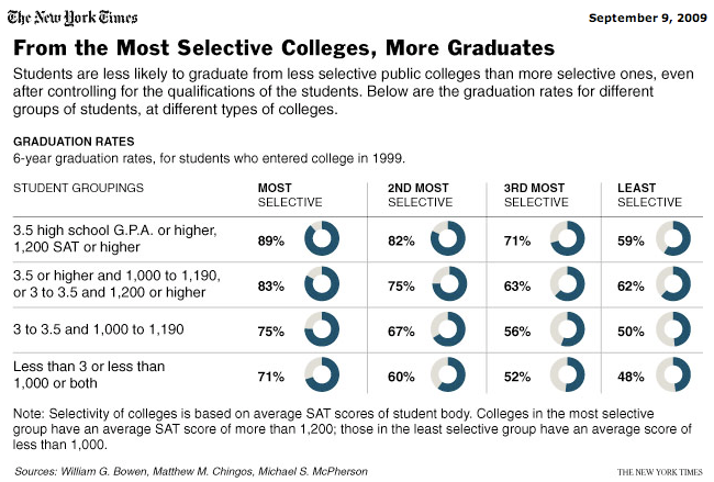
This chart is used to illustrate this conclusion. We will come to the graphical offering later but first I want to fill in some details omitted from David's article by walking through how a statistician would look at this matter, what it means by "controlling for" something.
The question at hand is whether public universities, especially less selective ones, have "caused" students to lag behind in graduation rate. A first-order analysis would immediately find that the overall graduation rate at less selective public universities to be lower, about 20% lower, than at more selective public universities.
A doubter appears, and suggests that less selective schools are saddled with lower-ability students, and that would be the "cause" of lower graduation rates, as opposed to anything the schools actually do to students. Not so fast, the statistician now disaggregates the data and look at the graduation rates within subgroups of students with comparable ability (in this instance, the researchers used GPA and SAT scores as indicators of ability). This is known as "controlling for the ability level". The data now shows that at every ability level, the same gap of about 20% exists: about 20% fewer students graduate at the less selective colleges than at the more selective ones. This eliminates the mix of abilities as a viable "cause" of lower graduation rates.
The researchers now conclude that conditions of the schools (I think they blame the administrators) "caused" the lower graduation rates. Note, however, that this does not preclude factors other than mix of abilities and school conditions from being the real "cause" of lower graduation rates. But as far as this analysis goes, it sounds pretty convincing to me.
That is, if I ignore the fact that graduation rates are really artifacts of how much the administrators want to graduate students. As the book review article pointed out, at the less selective colleges, they may want to reduce graduation rates in order to save money since juniors and seniors are more expensive to support due to smaller class sizes and so on. On the other hand, the most selective colleges have an incentive to maintain a near-perfect graduation rates since the US News and other organizations typically use this metric in their rankings -- if you were the administrator, what would you do? (You didn't hear it from here.)
Back to the chart, or shall we say the delivery of 16 donuts?
First, it fails the self-sufficiency principle. If we remove the graphical bits, nothing much is lost from the chart. Both are equally impenetrable.
A far better alternative is shown below, using a type of profile chart.
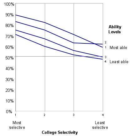
Finally, I must mention that in this particular case, there is no need to draw all four lines. Since the finding of a 20% gap essentially holds for all subgroups, no information is lost by collapsing the subgroups and reporting the average line instead (with a note explaining that the same effect affected every subgroup).
By the way, that is the difference between the statistical grapher - who is always looking to simplify the data - and the information grapher - who is aiming for fidelity.
Reference: "Colleges are lagging in graduation rates", New York Times, Sept 9, 2009; "Book review: (Not) Crossing the Finish Line", Inside Higher Education, Sept 9 2009.


