Simple is not always easy
Simple design is not always easy
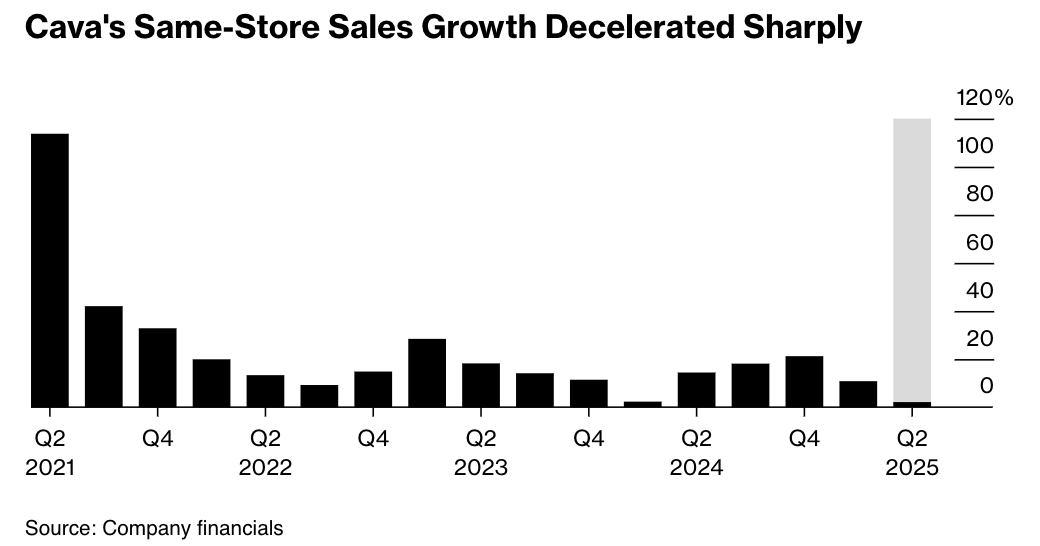
This chart is as simple as it gets. It can't get any simpler.
It's a column chart showing a single series of numbers (same store sales growth rate) over successive quarters.
Somehow, it's not as easy as it gets.
***
The designer did a great job channeling my attention to the far right column, which shows the most recent quarter of Q2, 2025. That's because the chart's trying to say something... something about the contrast of the tall gray column and the midget black column.
I don't see a legend. My first instinct is to think of the gray column as the expected value, and the black column as the realized value so that the gray part is the gap between expectation and reality. But this can't be true.
It's not true because after that one stellar quarter in Q2, 2021, all the subsequent values have been much lower. It's inconceivable that management would have predicted a return to that earlier performance level for the current quarter.
Is it possible that the black portion is a partial number while the gray part represents the excess yet to materialize? A common such situation is associated with part-year (realized) versus full-year (projected) values. This can't apply to our chart, either.
Then, I noticed that the gray column is level with the Q2, 2021 column, which represents the "high water mark" for Cava's historical same-store sales growth (at least for the time window of the chart). Perhaps the point is the comparison of the current quarter to the historical maximum. This theory is usurped when I pull out a ruler to discover that the top of the gray column is in fact a little higher than the Q2, 2021 column!
To show a reference level, I prefer a line or a symbol. For example:

or

***
It's odd they chose Q2, 2021 as the reference point. The data from the last few years should have made clear that Cava isn't likely to replicate that level of growth. Indeed, the news that caused a crash in Cava's stock price the other day is that:
Shares of Cava Group crashed in premarket trading after the Mediterranean fast-casual restaurant chain slashed its full-year same-store sales growth forecast to a maximum of 6%, versus the previous estimate of 8%.
This line suggests a different reference level: the projected growth previously communicated by Cava's management. Another possibility is the average growth in the same quarter over the last few quarters.
***

The inclusion of the "outlier" Q2, 2021 value of ~120% made it harder to differentiate the data for the other quarters, all of which were under 50%.
Also, note the axis labels being placed above, instead of next to, the tick marks. This small design flaw increases the reader's cognitive load significantly. Try figuring out the value of the two columns on the right.


