Some good bars
Efficient and effective
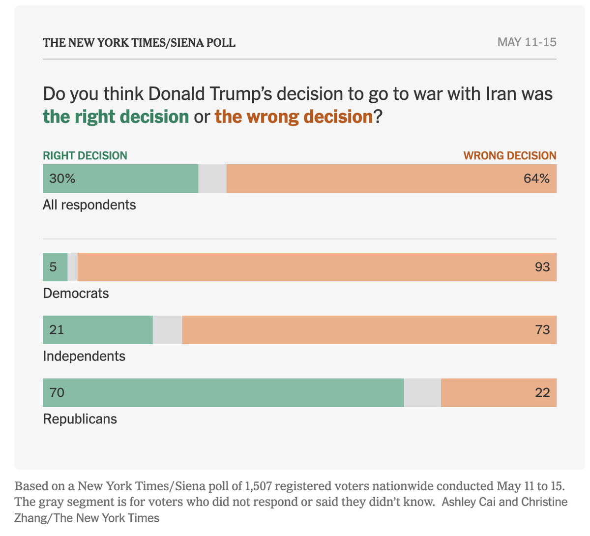
This New York Times article (paywall) about the President's approval ratings is a demonstration that one doesn't need fancy charts to deliver clear messages.
The structure of the data helps. Each bar has two meaningful categories, plus a missing category (undecided, didn't want to say, etc.). The missing/unknown category is neatly tucked in the middle, and given a dull gray color, unlabelled. It's third fiddle, as is appropriate.
The aggregate response is shown up top, followed by demographic breakdowns. It's a small-multiples design, even though it's not usually described as such.
The pattern in this data is also simple to interpret. Independents are placed in the middle, but on the war issue, they are much close to Democratic respondents than to Republican respondents.
This design is versatile. One can make similar charts using other demographic groups, like age groups, ethnic groups, income groups, and gender.
The design can also admit variations. The next chart utilizes it, with subtle differences.
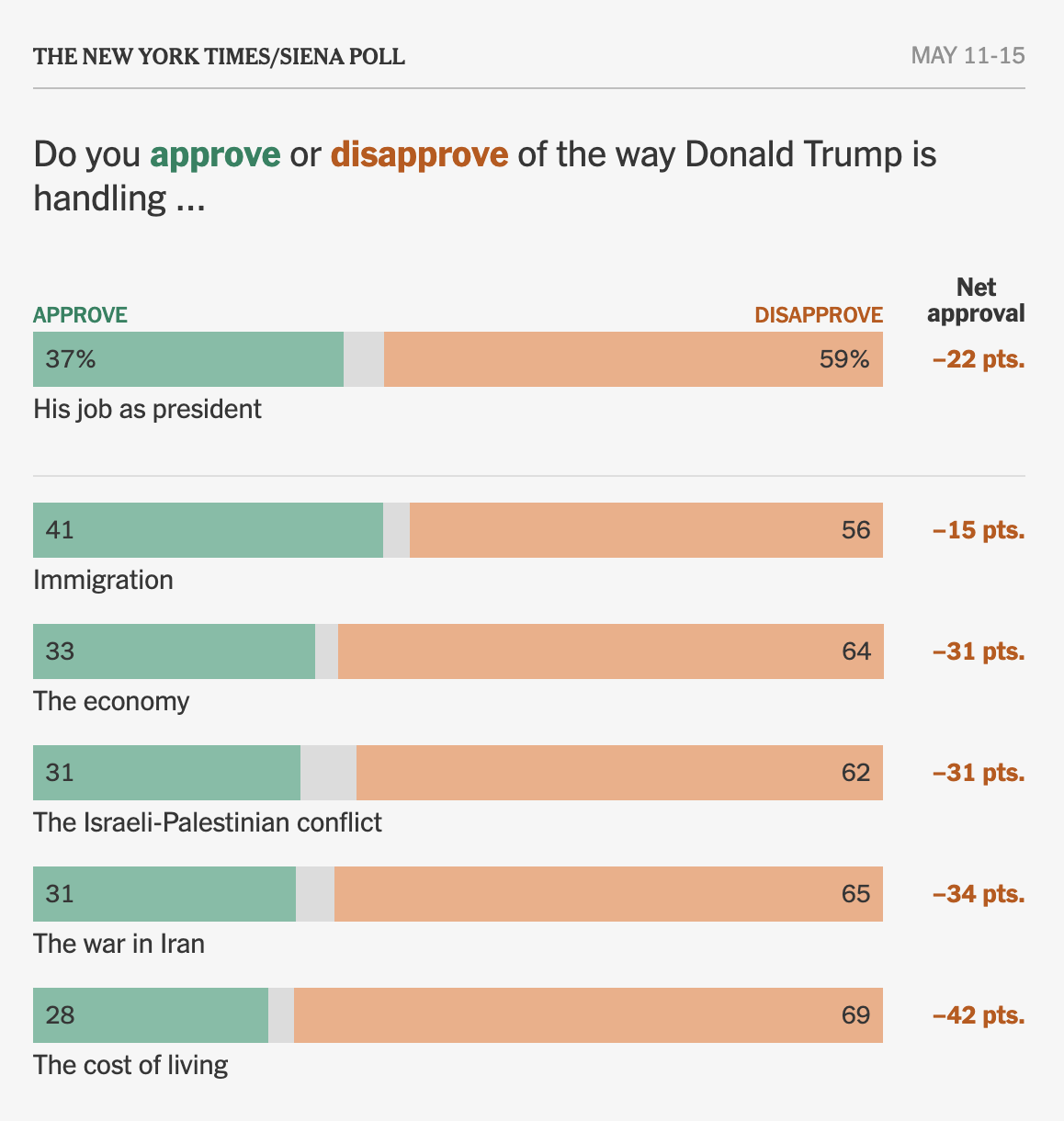
Every bar represents all respondents, regardless of political party. Each bar shows a different issue. The top bar depicts "his job as president" so in a sense, it is an aggregation of the data below. While the demographic breakdown is explicit and clear, the decomposition of all issues to individual issues is implicit and implied. We don't know what weights respondents attach to different issues when they gave the overall rating but the correlation between these ratings provides hints. So, the structure of this chart is similar but not quite the same as the first one.
The second chart also contains an additional column of information on the right. It shows the "net approval rating" which is defined as the percent approving minus the percent disapproving. This metric takes the view that each disapprover cancels out one approver.