Stone-age graphic
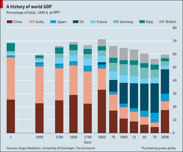
This Economist chart on the history of world GDP throws the art of graphics back several hundred years. (Thanks Tyler A. for the link.)

And I can't really re-make it since I can't make heads or tails of it.
- How are the columns sorted? (on second thought, maybe the 70 should read 1870, 13 is 1913, and so on?)
- Why are there differing gaps between columns?
- Italy was not a country, and the US was definitely not in existence in AD1 so what does it mean to have values for those on the chart? If this is created by taking current-day boundaries and projecting back in time, why are today's boundaries treated as sacrosanct?
- If the columns are sorted chronologically, a line chart would be much more readable. At the minimum, it will reduce the number of colors to 1. Note that multiple colors are necessitated by the choice of a stacked column chart.
- A stacked column chart with percentages should always extend to 100%. The current chart is very misleading if we want to know the percentage of world GDP produced by "other countries".
- How are the countries ordered within a column? It's neither alphabetical, nor by the starting or ending distributions.
- Don't challenge readers by having vertically stacked categories and a horizontal legend.
- It would also be much better if there are annotations to help the reader understand the chart, e.g. collapse of the Roman Empire, Renaissance, Great Depression, Big Fire, etc.
PS. [8/18/10] Dustin linked to a line-chart version of this chart, from the World Bank site, via Chartporn.

I think the evidence is right here as to why the Economist execution leaves a ton to be desired. The use of lines allows the reader to easily trace the rise and fall of different economies, which is the point of the data set. The stacked-column chart draws attention to a point-in-time distribution of GDP among different countries, which is of secondary importance.
There are other differences: this plots the share of "growth" as opposed to the share of total GDP. It also plots regions rather than countries (well, except for China and Japan). It does not presuppose that the US was in existence before its founding. It could have (should have) included an "rest of the world" line.
The spacing of the years is still problematic but it's an Excel inconvenience, really. But it's ok to stretch the axis on a line chart, it's a problem to do it with a column chart, as demonstrated above. The gaps between columns should be proportional to the years between the data but this is impossible to do in a column chart.


