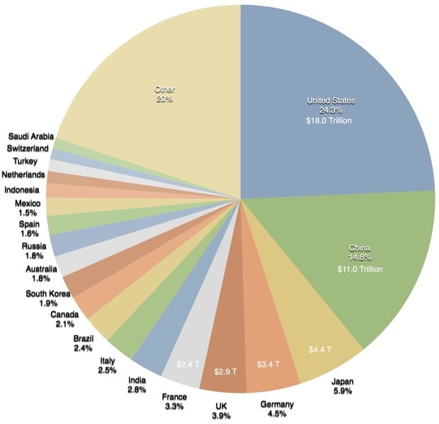
Junk Charts
  • About
  • RSS
  • Posts by Year
  • Posts by Keywords
Sign in Subscribe

Archive: 2017

Visualizing citation impact
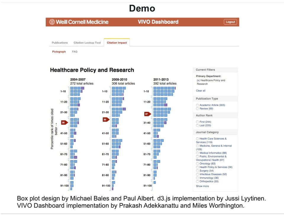
Comparability

Visualizing citation impact

Michael Bales and his associates at Cornell are working on a new
Read More
Dispute over analysis of school quality and home prices shows social science is hard
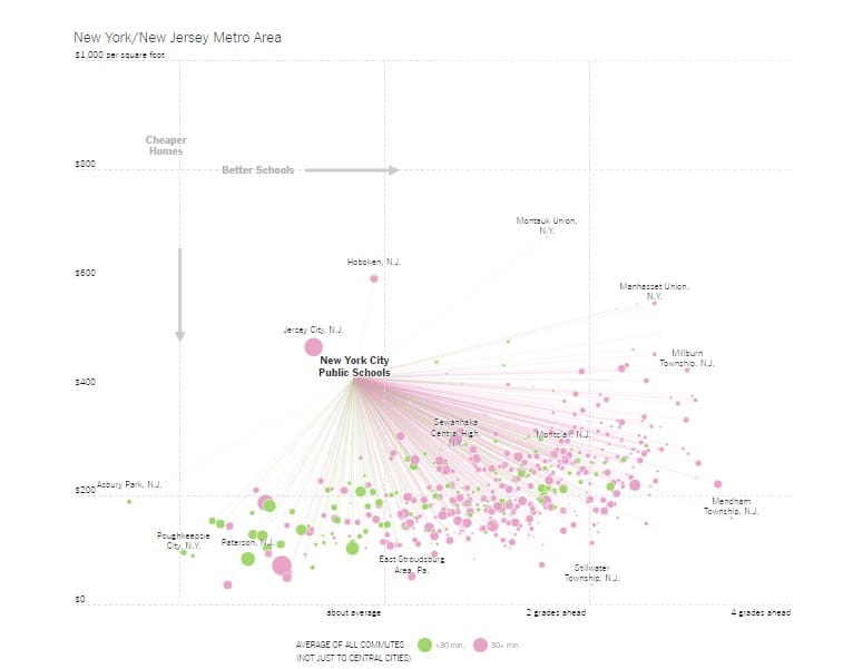
Aggregation

Dispute over analysis of school quality and home prices shows social science is hard

Most of my friends with families fret over school quality when deciding
Read More
Analytics-business interaction

Data sleaze: Uber and beyond

There has been a barrage of negative publicity related to Uber recently.
Read More
It's your fault when you use defaults
Aggregation

It's your fault when you use defaults

The following chart showed up on my Twitter feed last week. It&
Read More
Making people jump over hoops
Axis

Making people jump over hoops

Kaiser Fung, founder of Principal Analytics Prep and Junk Charts, comments on a WSJ chart about how banks pay their brokers
Read More
Another simple Excel chart needs help
Axis

Another simple Excel chart needs help

Kaiser Fung, founder of Principal Analytics Prep and Junk Charts, takes apart an Elon Musk chart, created using some Excel defaults.
Read More
← Newer Posts Page 2 of 3 Older Posts →
Junk Charts © 2025
  • BOOKS
  • COURSES
  • PRESS
  • CONSULTING
  • COACHING
  • CONTACT
Powered by Ghost