Junk Charts
About
RSS
Posts by Year
Posts by Keywords
Sign in
Subscribe
Archive: 2024
Axis
Adjust, and adjust some more
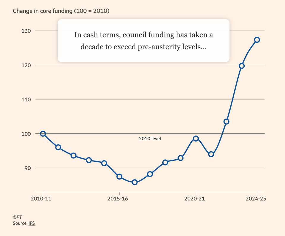
Kaiser looks at an interactive chart in the Financial Times.
Background
The radial is still broken
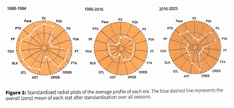
Kaiser puzzles out yet another radial chart.
Bar chart
Is this dataviz?
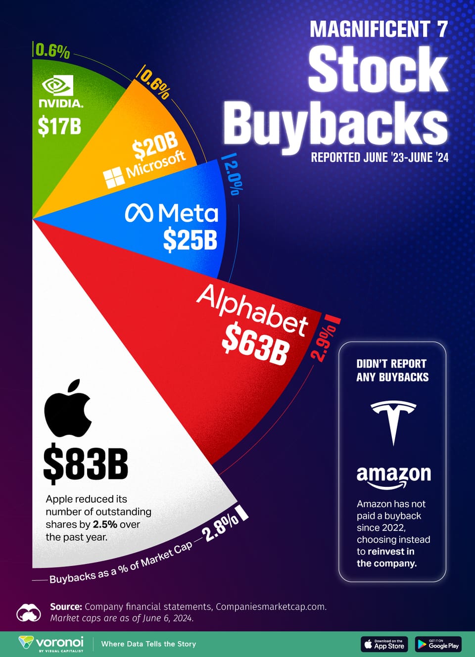
Kaiser looks for the data behind this pie chart.
Bar chart
When should we use bar charts?
Kaiser looks at two column charts.
Analytics-business interaction
A paradox of big data
Kaiser tries the new subway card.
Business
Know your data 37: one billion passwords
What one billion stolen passwords tell us
←
Newer Posts
Page 6 of 14
Older Posts
→