ray vella Displaying convoluted indices Kaiser shows how a small change in structure clarifies comparisons on a data visualization project.
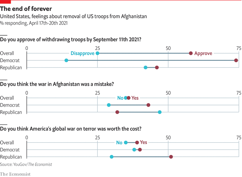
return on effort Reading this chart won't take as long as withdrawing troops from Afghanistan Kaiser deciphers a chart showing Americans' response to Biden's decision to withdraw troops from Afghanistan.
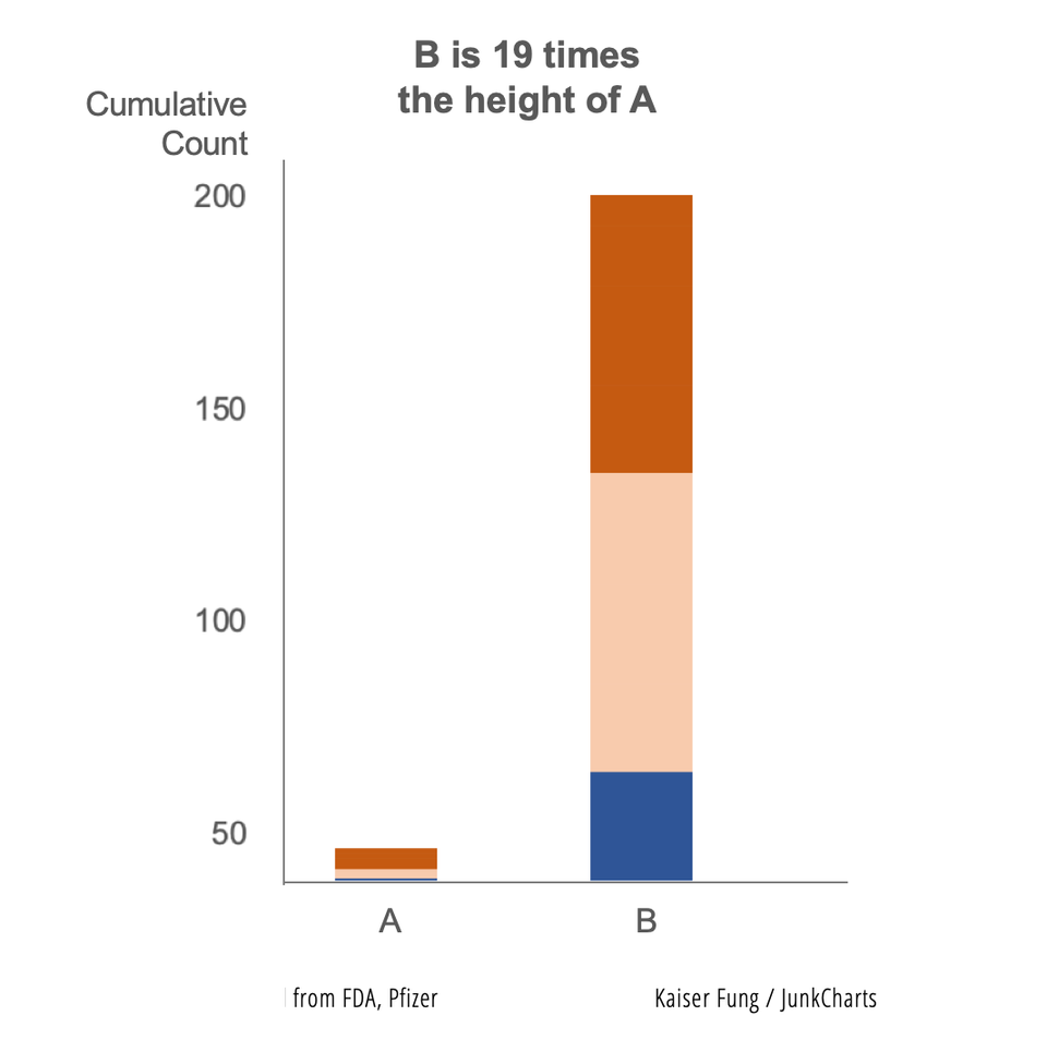
Axis Vaccine researchers discard the start-at-zero rule Kaiser revisits the practice of manipulating the vertical axis of a column chart.
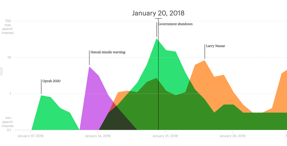
Aggregation Check out the Lifespan of News project Kaiser Fung (Junkcharts, Principal Analytics Prep) reviews the Lifespan of News project that tracks the rise and fall of news stories over time and space, using Google search data.
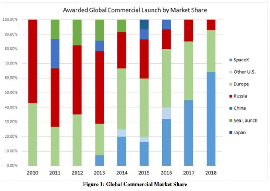
Axis Another simple Excel chart needs help Kaiser Fung, founder of Principal Analytics Prep and Junk Charts, takes apart an Elon Musk chart, created using some Excel defaults.