Junk Charts
  • About
  • RSS
  • Posts by Year
  • Posts by Keywords
Sign in Subscribe

Bloomberg

Aligning the visual and the message
ray vella

Aligning the visual and the message

Student of Ray Vella's NYU class produces a delightful project
Read More
How hard can counting be?
Analytics-business interaction

How hard can counting be?

How hard can counting be? Reflections on the jump in homeless in the US
Read More
Dot plots with varying dot sizes
Aggregation

Dot plots with varying dot sizes

An example of a dot plot with varying dot sizes
Read More
Fantastic auto show from the Bloomberg crew
Bar chart

Fantastic auto show from the Bloomberg crew

Bloomberg Graphics put on an auto show
Read More
Bloomberg made me digest these graphics slowly
return on effort

Bloomberg made me digest these graphics slowly

Kaiser enjoys reading the graphics in the Businessweek issue on elections.
Read More
Finding meaning in Big Blue California
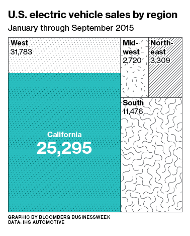
Area chart

Finding meaning in Big Blue California

Via Twitter, Pat complained that this Bloomberg graphic is confusing: The accompanying
Read More
Page 1 of 1
Junk Charts © 2025
  • BOOKS
  • COURSES
  • PRESS
  • CONSULTING
  • COACHING
  • CONTACT
Powered by Ghost