Junk Charts
  • About
  • RSS
  • Posts by Year
  • Posts by Keywords
Sign in Subscribe

Color

Guide to using pairs of circles
Bubble chart

Guide to using pairs of circles

A discussion of some design decisions
Read More
Alternatives to radar chart 1
Table

Alternatives to radar chart 1

Sometimes, a table is all you need
Read More
Visualizing hierarchies
sports analytics

Visualizing hierarchies

Bonus: setting gridlines on a circular chart
Read More
The smell of pie charts
Pie chart

The smell of pie charts

An attempt to deodorize
Read More
The largest gambling market in Europe, and the largest online
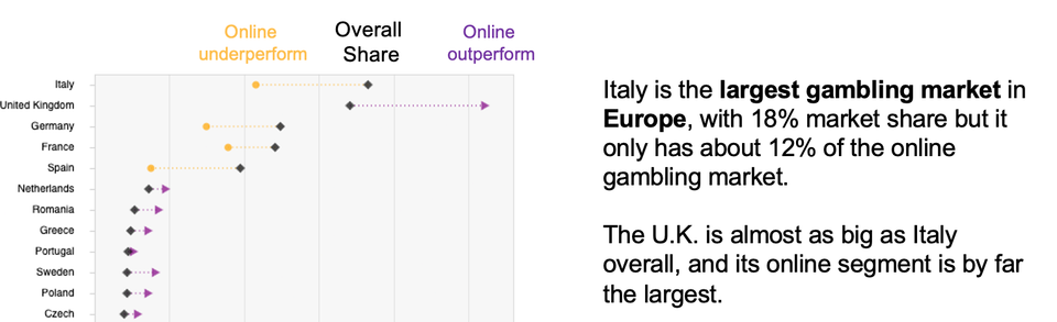
visual storytelling

The largest gambling market in Europe, and the largest online

Kaiser re-imagines the chart about Europe's gambling revenues.
Read More
Forced roommates, favoritism, and more in data visualization
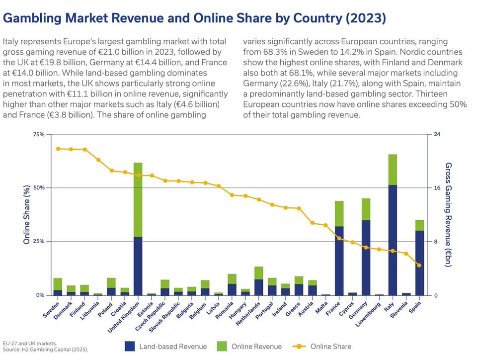
dual axes

Forced roommates, favoritism, and more in data visualization

Why is this dual-axes chart so taxing to read?
Read More
Page 1 of 20 Older Posts →
Junk Charts © 2026
  • BOOKS
  • COURSES
  • PRESS
  • CONSULTING
  • COACHING
  • CONTACT
Powered by Ghost