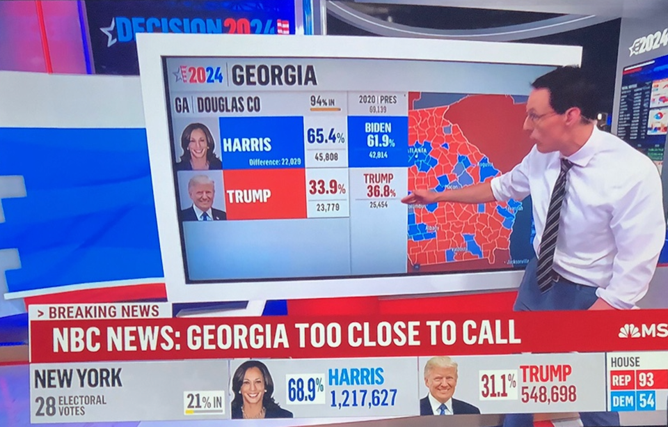
Aggregation Election coverage prompts good graphics Election coverage brings out the best of interactive graphics
ray vella Displaying convoluted indices Kaiser shows how a small change in structure clarifies comparisons on a data visualization project.
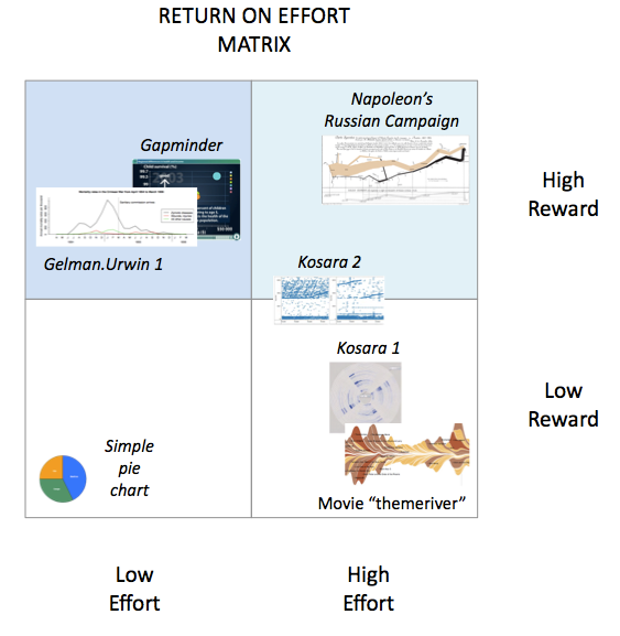
return on effort The return on effort in data graphics The higher the effort, the greater should be its reward