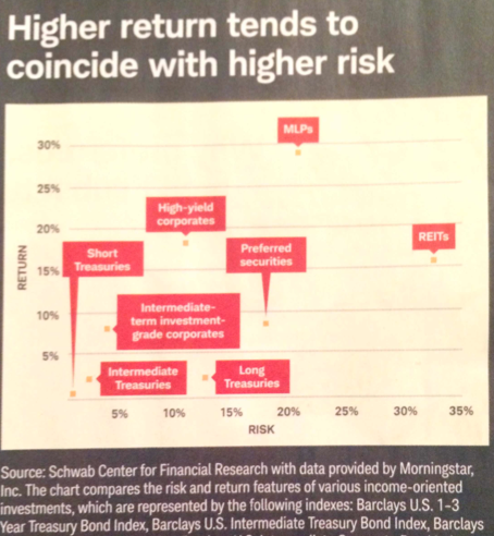
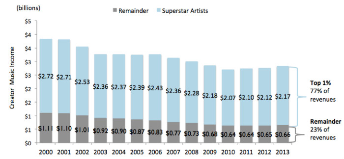
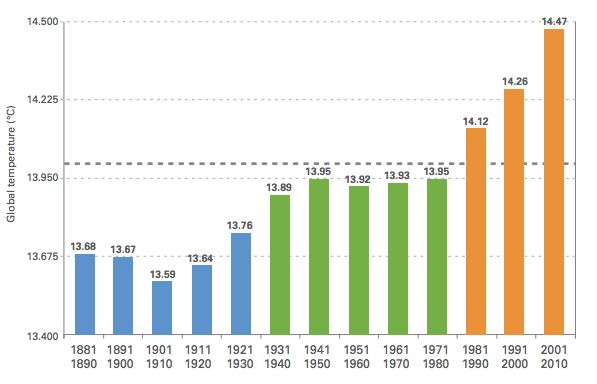
Bumps chart Where a scatter plot fails Found this chart in the magazine that Charles Schwab sends to customers:
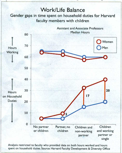
Aggregation Exquisite chart by-of-for academics This chart published in Harvard Magazine has won my heart. It is
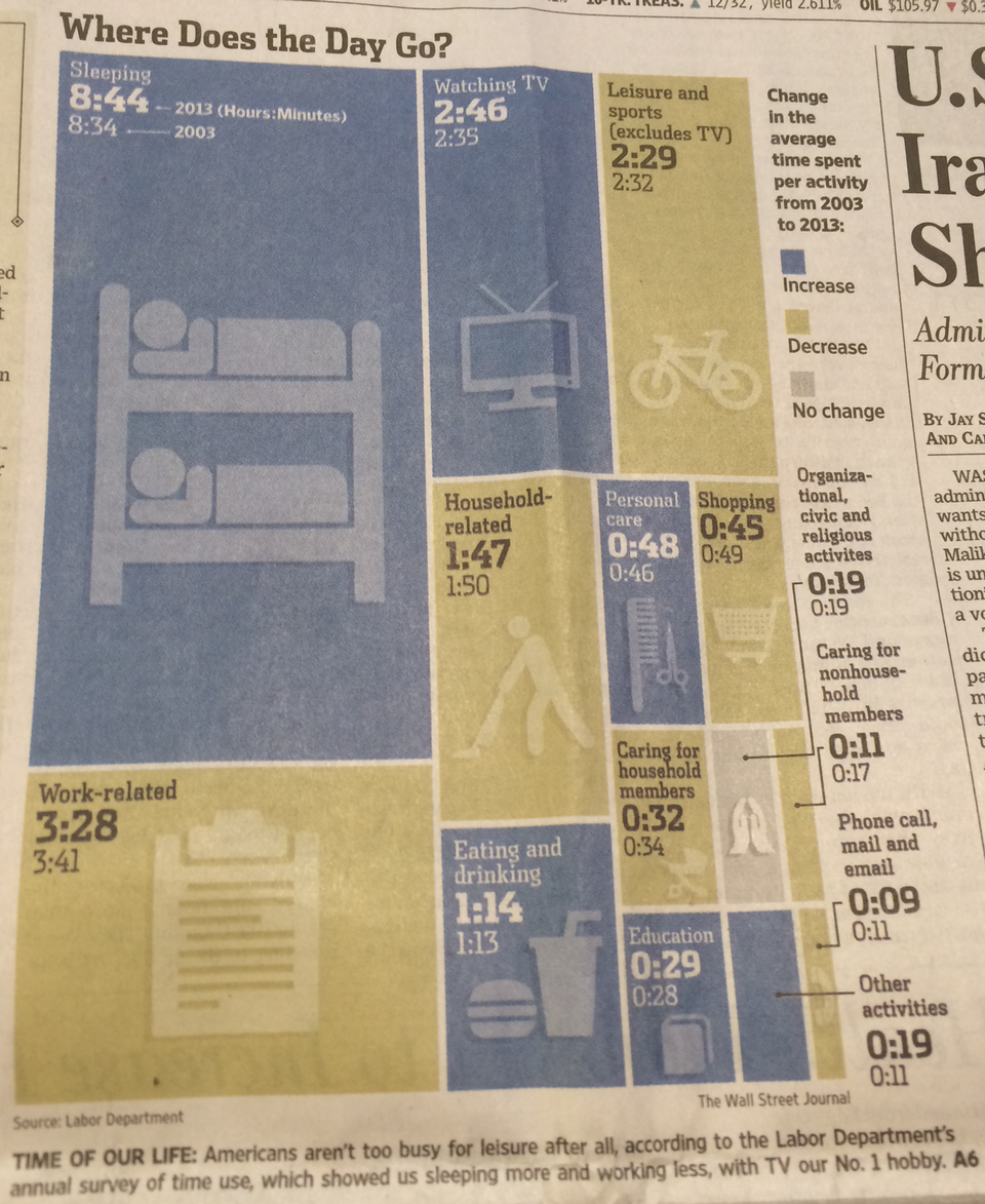
Aggregation Respect the reader's time A graphic illustrating how Americans spend their time is a perfect foil