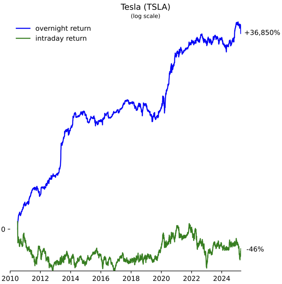
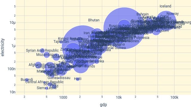
Axis On the interpretability of log-scaled charts Are log charts using original value labels more interpretable?