Junk Charts
  • About
  • RSS
  • Posts by Year
  • Posts by Keywords
Sign in Subscribe

dataviz

Decluttering charts
Clustering

Decluttering charts

Decluttering charts
Read More
Coffee in different shapes and sizes: a test of self-sufficiency
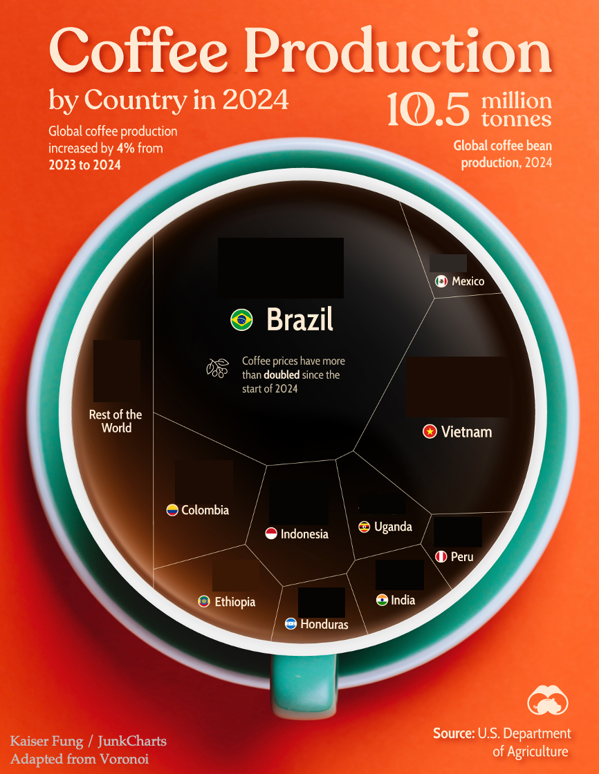
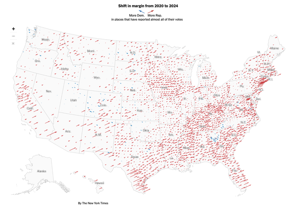
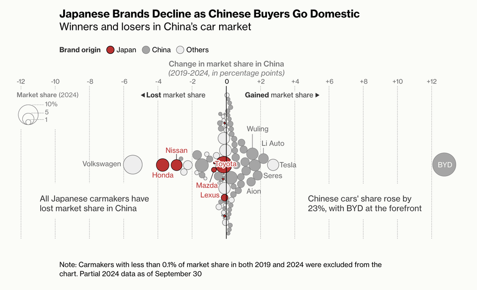
treemap

Coffee in different shapes and sizes: a test of self-sufficiency

You'd need more coffee to read this chart
Read More
What is this "stacked range chart"?
Aggregation

What is this "stacked range chart"?

Do we need this "stacked range chart"?
Read More
Digital revolution in China: two visual takes
Aggregation

Digital revolution in China: two visual takes

Kaiser Fung, founder of JunkCharts and Principal Analytics Prep, discusses a map in the Economist about the digital silk road in China. What's the story?
Read More
Foodies say, add dataviz spice please
Food

Foodies say, add dataviz spice please

Kaiser Fung, founder of Junk Charts and Principal Analytics Prep, explains why the Venn diagram is not easy to read, and discusses some nice interesting food and beverage menus.
Read More
Excel is the graveyard of charts, no!
Bar chart

Excel is the graveyard of charts, no!

Kaiser Fung, creator of Junk Charts blog and founder of Principal Analytics Prep, encourages Excel users to work harder at making nice data graphics.
Read More
Page 1 of 2 Older Posts →
Junk Charts © 2025
  • BOOKS
  • COURSES
  • PRESS
  • CONSULTING
  • COACHING
  • CONTACT
Powered by Ghost