Junk Charts
  • About
  • RSS
  • Posts by Year
  • Posts by Keywords
Sign in Subscribe

dataviz

the wtf moment
Bar chart

the wtf moment

the wtf moment in dataviz
Read More
Making colors and groups come alive
Bar chart

Making colors and groups come alive

How to use color effectively in a dataviz
Read More
Expert handling of multiple dimensions of data
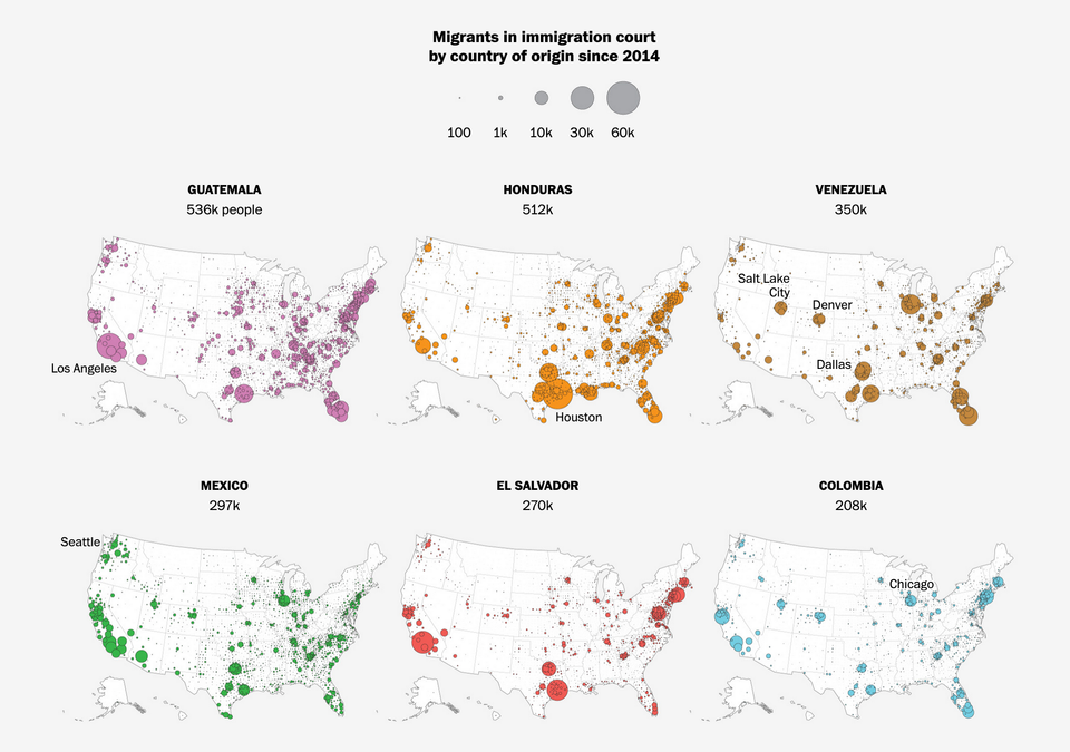
Current affairs

Expert handling of multiple dimensions of data

Kaiser enjoys a set of maps about American immigration.
Read More
The radial is still broken
Background

The radial is still broken

Kaiser puzzles out yet another radial chart.
Read More
Excess delay
Bar chart

Excess delay

Kaiser finds a chart that analyzes London's congestion charging programme.
Read More
Chart without an axis
Axis

Chart without an axis

Kaiser looks at a variant of a standard chart form.
Read More
← Newer Posts Page 2 of 5 Older Posts →
Junk Charts © 2025
  • BOOKS
  • COURSES
  • PRESS
  • CONSULTING
  • COACHING
  • CONTACT
Powered by Ghost