Junk Charts
  • About
  • RSS
  • Posts by Year
  • Posts by Keywords
Sign in Subscribe

dataviz

A nice plot of densities, but what's behind the colors?
density

A nice plot of densities, but what's behind the colors?

Kaiser is intrigued by a plot of densities.
Read More
The Taylor Swift ticketing fiasco
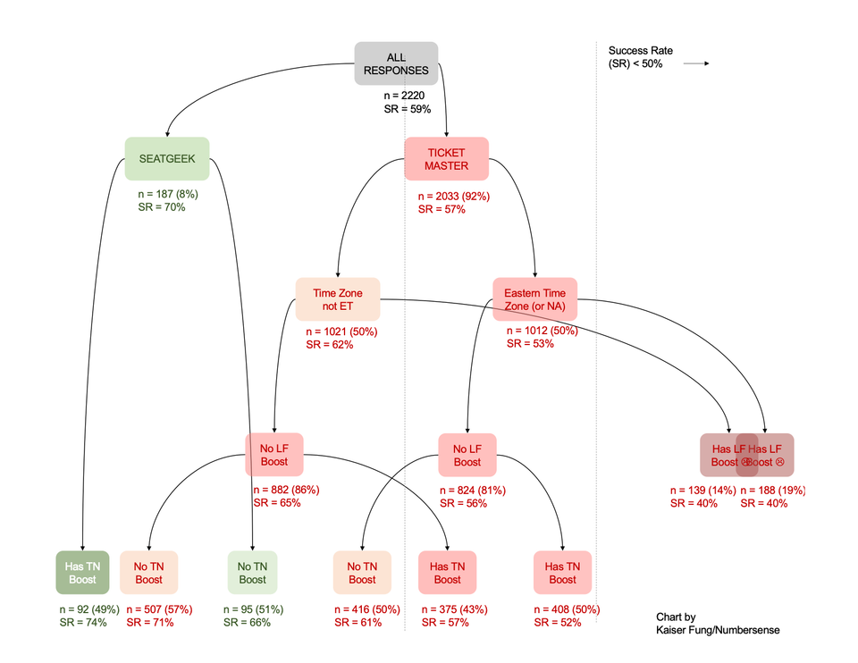
Algorithms

The Taylor Swift ticketing fiasco

Kaiser analyzes some survey data on Taylor Swift pre-sales for Slate
Read More
Funnels and scatters
ray vella

Funnels and scatters

Kaiser looks at some student work.
Read More
Selecting the right analysis plan is the first step to good dataviz
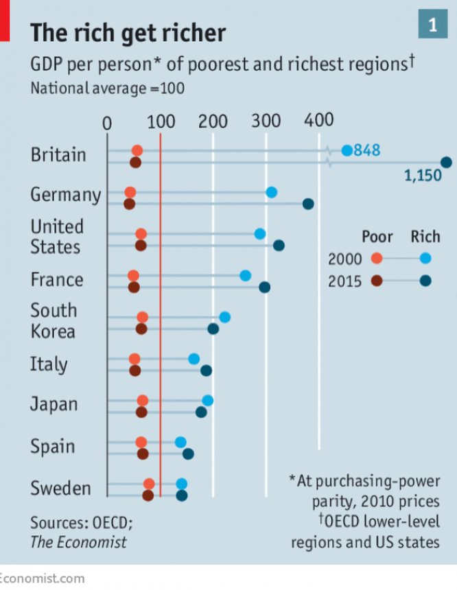
ray vella

Selecting the right analysis plan is the first step to good dataviz

Kaiser shows how the data analysis plan impacts dataviz success
Read More
Do better
Covid-19

Do better

Kaiser reads some misleading NEJM data graphics.
Read More
The fun and frustration of seeking context
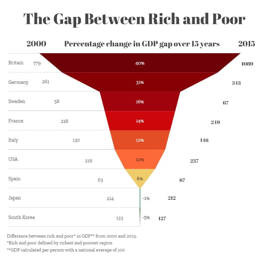
Aggregation

The fun and frustration of seeking context

Kaiser comments on the tricky business of introducing context to an exploratory data analysis.
Read More
← Newer Posts Page 3 of 5 Older Posts →
Junk Charts © 2026
  • BOOKS
  • COURSES
  • PRESS
  • CONSULTING
  • COACHING
  • CONTACT
Powered by Ghost