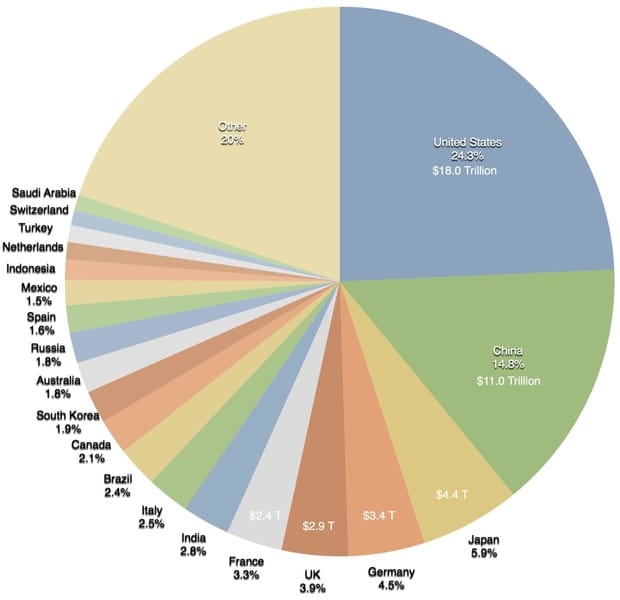
onelesspie Making the world a richer place #onelesspie #PiDay A colorful pie chart on Wikipedia, saying not much
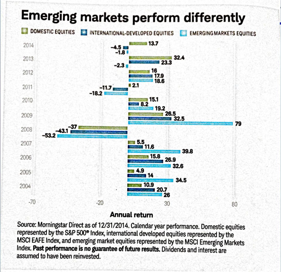
Aggregation Depicting imbalance, straying from the standard chart My friend Tonny M. sent me a tip to two pretty nice
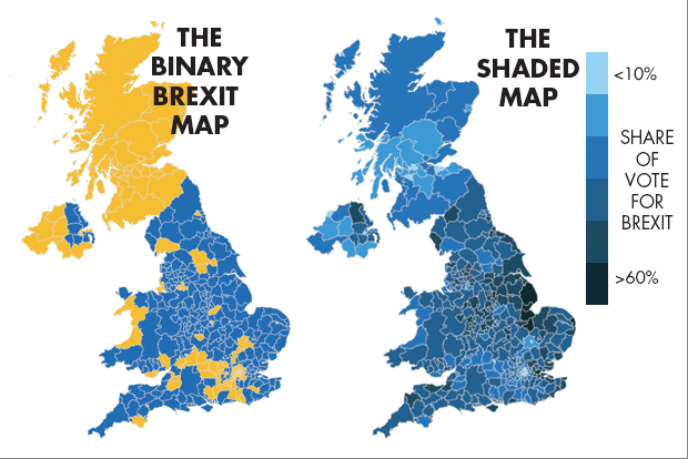
Aggregation Brexit, Bremain, the world did not end so dataviz people can throw shade and color Pick your own distortion
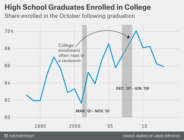
Axis Nice title but dubious message I like to uaeuse declarative titles for charts. This chart below, found
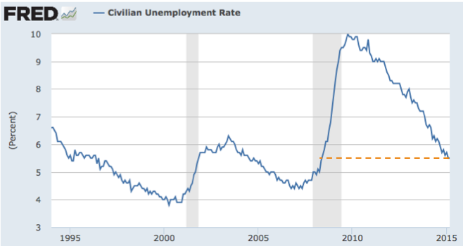
Aggregation Painting the full picture of the employment situation It's very frustrating to read the mainstream articles about the