ray vella Selecting the right analysis plan is the first step to good dataviz Kaiser shows how the data analysis plan impacts dataviz success
Assumptions Open questions of the pandemic, part 1 Kaiser discusses some open questions of the Covid-19 pandemic
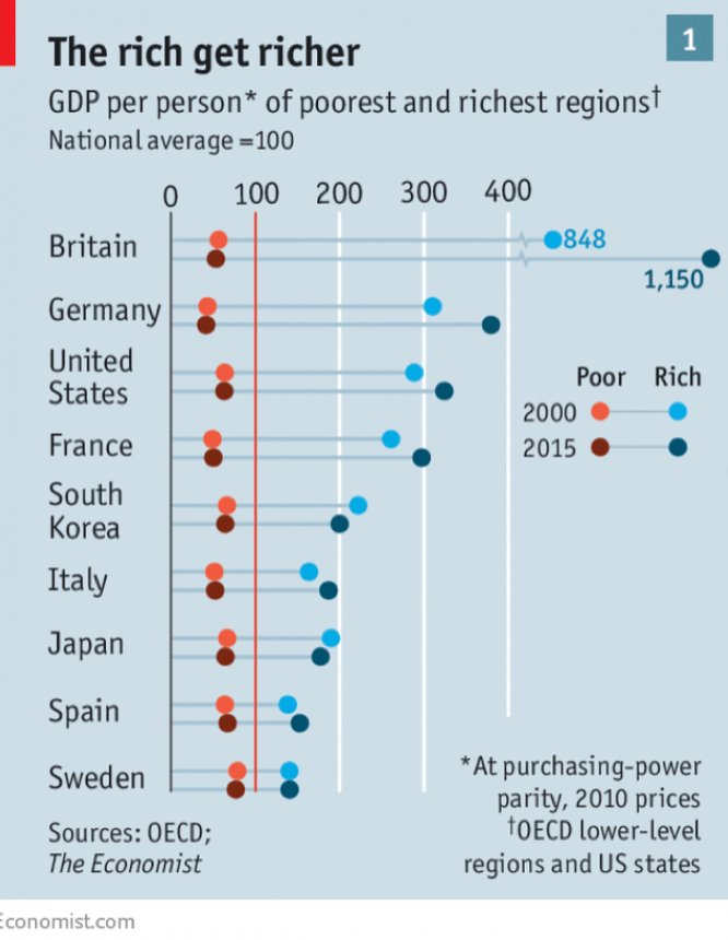
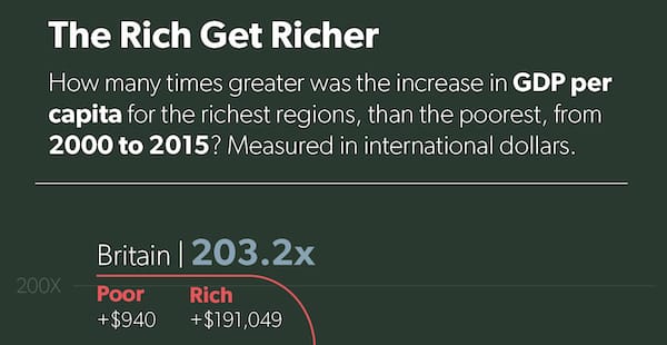
ray vella Displaying convoluted indices Kaiser shows how a small change in structure clarifies comparisons on a data visualization project.
ray vella Two commendable student projects, showing different standards of beauty Kaiser discusses two dataviz projects by NYU students.