Junk Charts
  • About
  • RSS
  • Posts by Year
  • Posts by Keywords
Sign in Subscribe

Environment

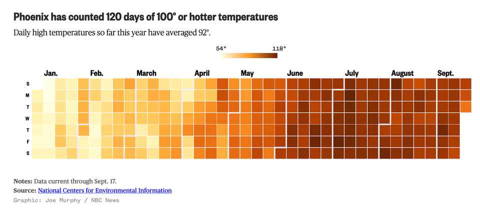
Aligning the visual and the message to hot things up
Color

Aligning the visual and the message to hot things up

How hot is Phoenix
Read More
Waze user saying
Algorithms

Waze user saying

Another Waze user sends testimony.
Read More
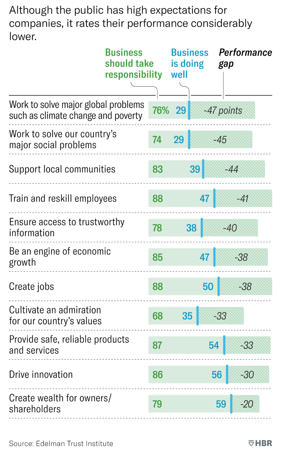
Reading log: HBR's specialty bar charts
Bar chart

Reading log: HBR's specialty bar charts

Today, I want to talk about a type of analysis that I
Read More
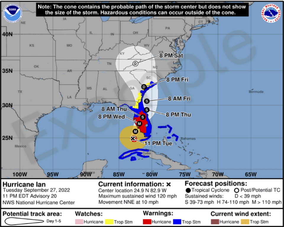
Do you want a taste of the new hurricane cone?
Aggregation

Do you want a taste of the new hurricane cone?

The National Hurricane Center (NHC) put out a press release (link to
Read More
The cult of raw unadjusted data
Data

The cult of raw unadjusted data

Kaiser looks at a chart that supposedly says nothing.
Read More
Finding meaning in Big Blue California
Area chart

Finding meaning in Big Blue California

Via Twitter, Pat complained that this Bloomberg graphic is confusing: The accompanying
Read More
← Newer Posts Page 2 of 6 Older Posts →
Junk Charts © 2026
  • BOOKS
  • COURSES
  • PRESS
  • CONSULTING
  • COACHING
  • CONTACT
Powered by Ghost