Junk Charts
About
RSS
Posts by Year
Posts by Keywords
Sign in
Subscribe
Finance
Color
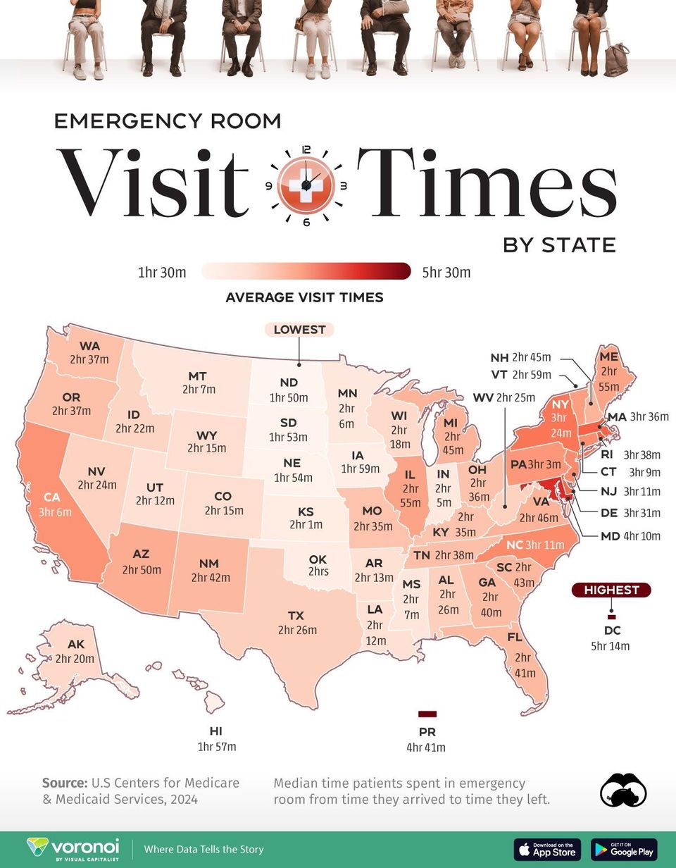
Patiently looking
Patiently looking at a map
Bar chart
Tidying up the details
Fixing up little details on a data graphic pays dividends
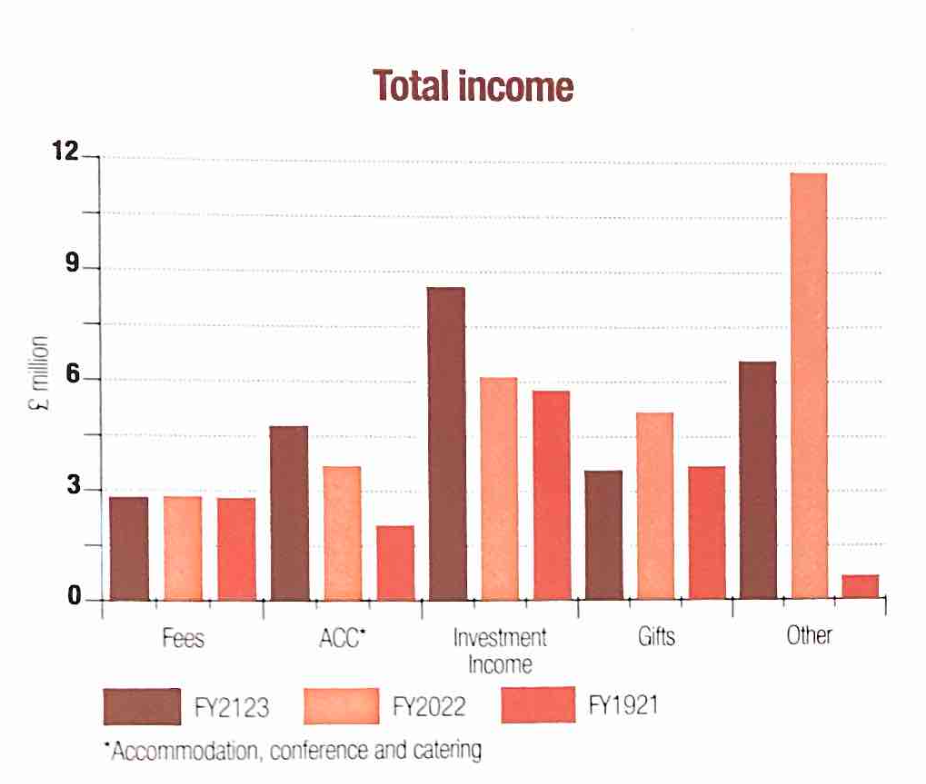
Bar chart
Making colors and groups come alive
How to use color effectively in a dataviz
Business
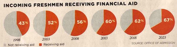
Pie charts and self-sufficiency
A series of pie charts is used to demonstrate a trend
Bar chart
When should we use bar charts?
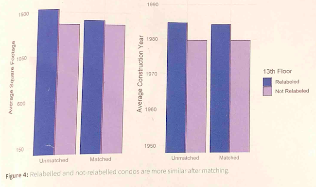
Kaiser looks at two column charts.
Axis
Adjust, and adjust some more
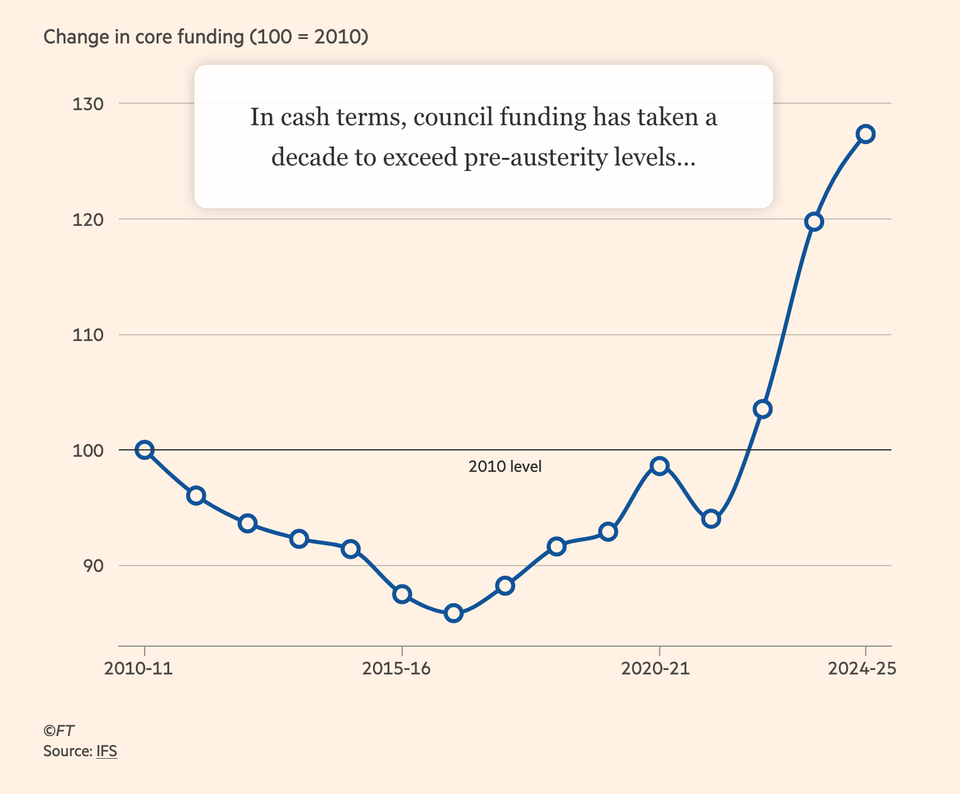
Kaiser looks at an interactive chart in the Financial Times.
←
Newer Posts
Page 2 of 9
Older Posts
→