Business To a new year of pleasant surprises Kaiser finds a noisy map of the AI space. Happy new year!
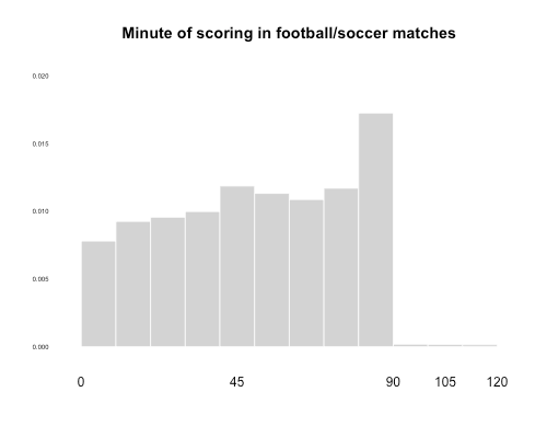
histogram Equal-area histograms Kaiser explores a variant of the histogram for plotting data distributions.
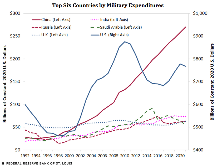
dual axes Dual axes: a favorite of tricksters Kaiser comes across a quintessential example of using dual axes with intent to mislead.
ray vella Selecting the right analysis plan is the first step to good dataviz Kaiser shows how the data analysis plan impacts dataviz success