Junk Charts
  • About
  • RSS
  • Posts by Year
  • Posts by Keywords
Sign in Subscribe

junkcharts

Adjust, and adjust some more
Axis

Adjust, and adjust some more

Kaiser looks at an interactive chart in the Financial Times.
Read More
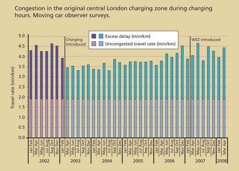
Excess delay
Bar chart

Excess delay

Kaiser finds a chart that analyzes London's congestion charging programme.
Read More
Prime visual story-telling
Clustering

Prime visual story-telling

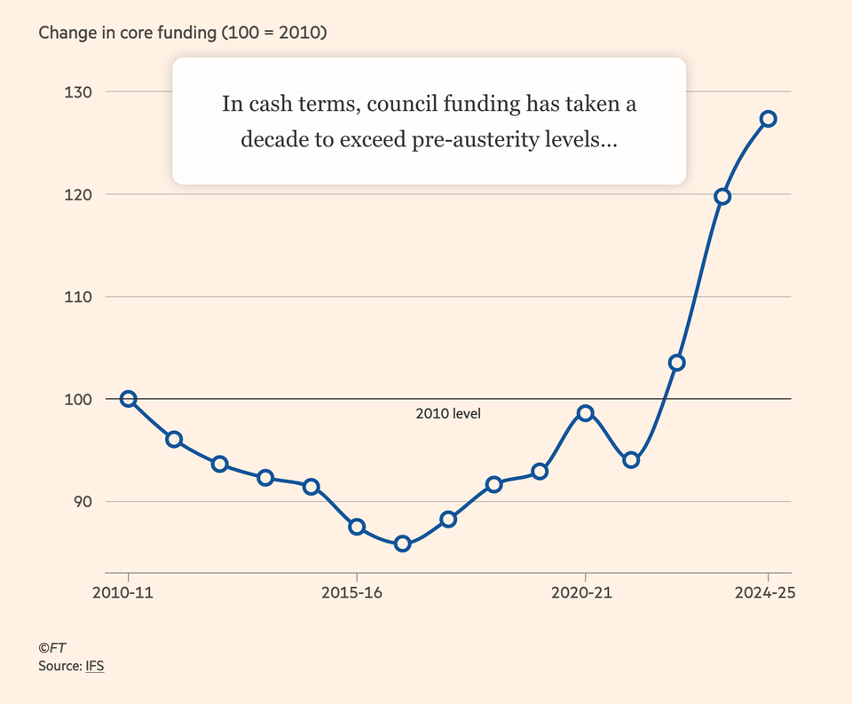
Kaiser appreciates this wonderful example of visual storytelling.
Read More
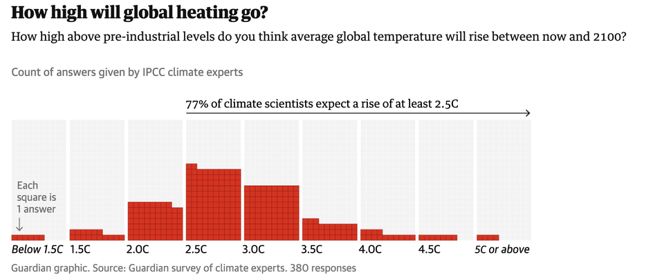
Chart without an axis
Axis

Chart without an axis

Kaiser looks at a variant of a standard chart form.
Read More
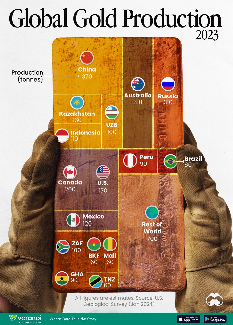
One doesn't have to plot raw data
Aggregation

One doesn't have to plot raw data

Kaiser looks at gold production worldwide.
Read More
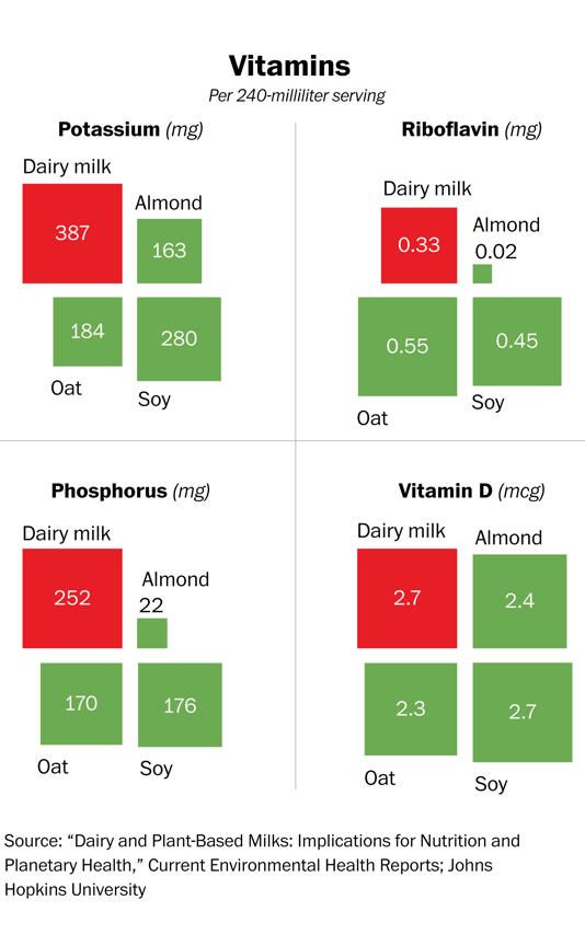
Aligning V and Q by way of D
Bar chart

Aligning V and Q by way of D

Kaiser reads a chart comparing different types of "milk".
Read More
← Newer Posts Page 17 of 64 Older Posts →
Junk Charts © 2026
  • BOOKS
  • COURSES
  • PRESS
  • CONSULTING
  • COACHING
  • CONTACT
Powered by Ghost