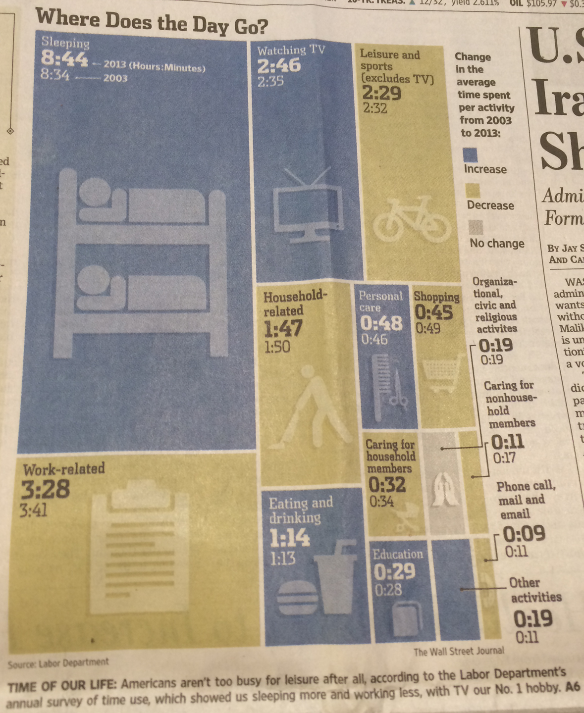
Aggregation Respect the reader's time A graphic illustrating how Americans spend their time is a perfect foil
Aggregation Getting the basics right is half the battle I was traveling quite a lot recently, and last week, read the
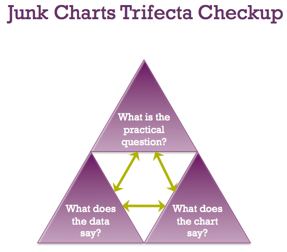
trifecta checkup Junk Charts Trifecta Checkup: The Definitive Guide Kaiser Fung, from Junk Charts, explains the data visualization framework known as the Trifecta Checkup, used to conceptualize and critique data graphics and charts.
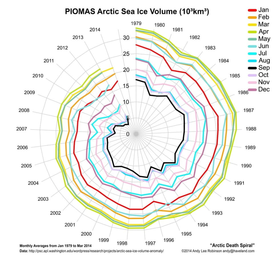
Spider chart An overused chart, why it fails, and how to fix it A chart with conceptual appeal but fails the data