Aggregation Two unhealthy submissions from readers Josh hated this "dataless visualization" from ABC. (link; warning: ads)
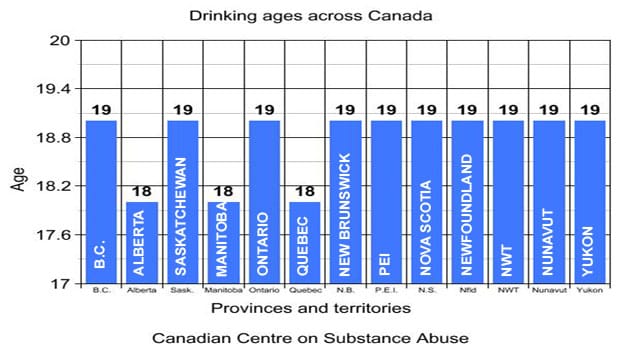
Axis Which software is responsible for this? @guitarzan wants us to see this chart from north of the border,
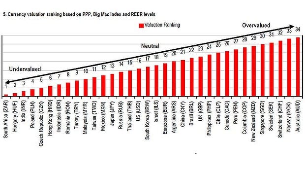
Bar chart A straight line going nowhere fast, despite tweets and likes Ken B., another Australian reader, wasn't too proud of this
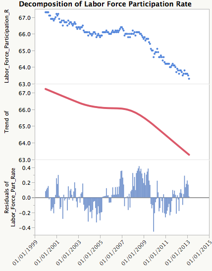
Axis Four numbers say little, even on a busy chart Reader Robert J. calls this a "really bad" chart (link)