Junk Charts
About
RSS
Posts by Year
Posts by Keywords
Sign in
Subscribe
junkcharts
Area chart
Leave good alone
In Cousin misfit, we looked at a problematic area chart in which
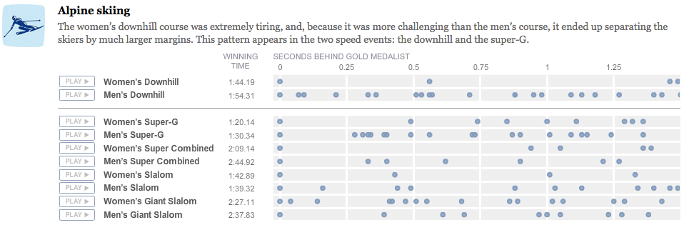
Dot plot
Auditory aid
This effort by the NYT graphics team is breath-taking. They use dot
Area chart
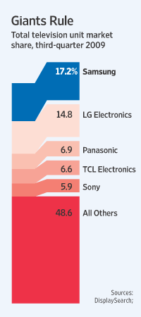
Cousin misfit
Stef, who had a hand in the inkblot charts that many loved,
Axis
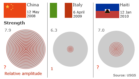
Aftershocks
The graphs in this BBC article comparing several recent earthquakes hit us
Archive: 2010
Facelift
Welcome to the new Junk Charts. Apart from the facelift (thanks to
Statistics
The Book
One of the reasons I started Junk Charts five years ago was
←
Newer Posts
Page 37 of 59
Older Posts
→