Junk Charts
  • About
  • RSS
  • Posts by Year
  • Posts by Keywords
Sign in Subscribe

Map

Check out the Lifespan of News project
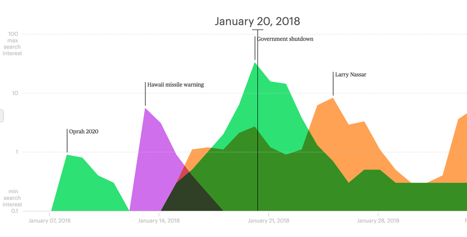
Aggregation

Check out the Lifespan of News project

Kaiser Fung (Junkcharts, Principal Analytics Prep) reviews the Lifespan of News project that tracks the rise and fall of news stories over time and space, using Google search data.
Read More
Digital revolution in China: two visual takes
Aggregation

Digital revolution in China: two visual takes

Kaiser Fung, founder of JunkCharts and Principal Analytics Prep, discusses a map in the Economist about the digital silk road in China. What's the story?
Read More
Brexit, Bremain, the world did not end so dataviz people can throw shade and color
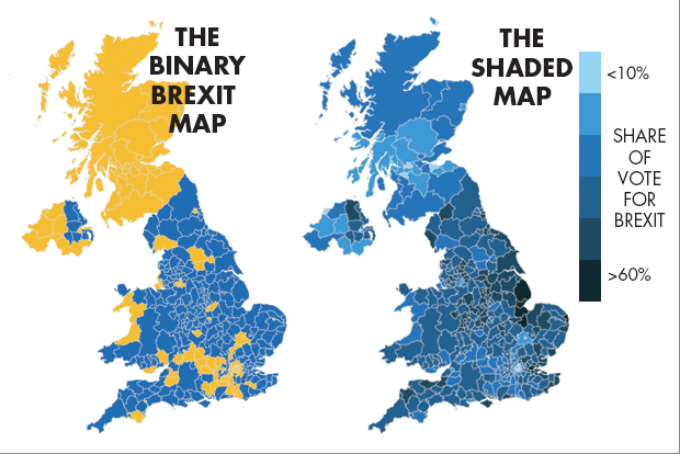
Aggregation

Brexit, Bremain, the world did not end so dataviz people can throw shade and color

Pick your own distortion
Read More
When in Seattle, don't look for the bus map
Map

When in Seattle, don't look for the bus map

The past week in Seattle, I was blessed with amazing weather. The
Read More
How effective visualization brings data alive
Aggregation

How effective visualization brings data alive

Bringing data alive
Read More
Small multiples with simple axes
Small multiples

Small multiples with simple axes

All the things they did well
Read More
← Newer Posts Page 4 of 8 Older Posts →
Junk Charts © 2026
  • BOOKS
  • COURSES
  • PRESS
  • CONSULTING
  • COACHING
  • CONTACT
Powered by Ghost