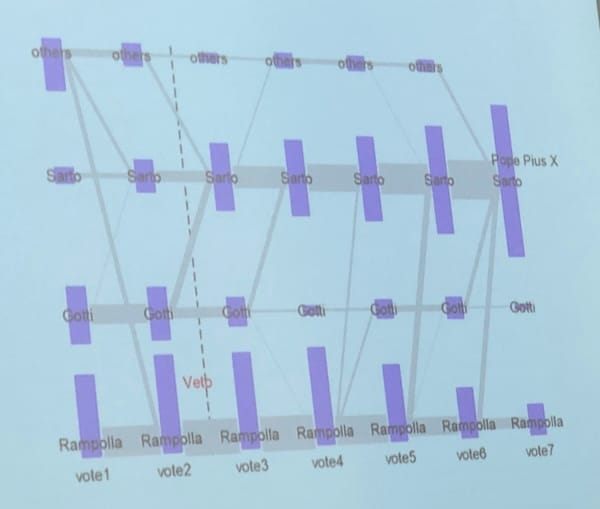
Aggregation Exquisite chart by-of-for academics This chart published in Harvard Magazine has won my heart. It is
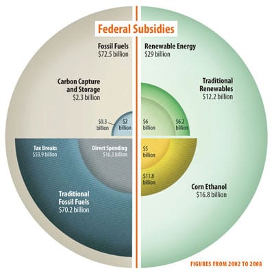
Aggregation Worst statistical graphic nominated Phil, over at the Gelman blog, nominates this jaw-dropping graphic as the
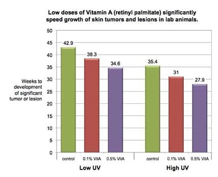
Axis Reading this before the long weekend may save your life Here's a chart that can save your life. Here'
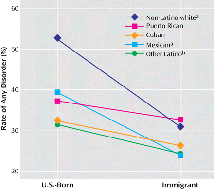
Aggregation Following one's nose 1 Andrew Gelman has a great post about a so-called Immigrant paradox here,