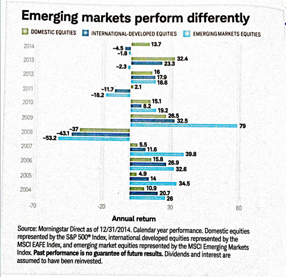
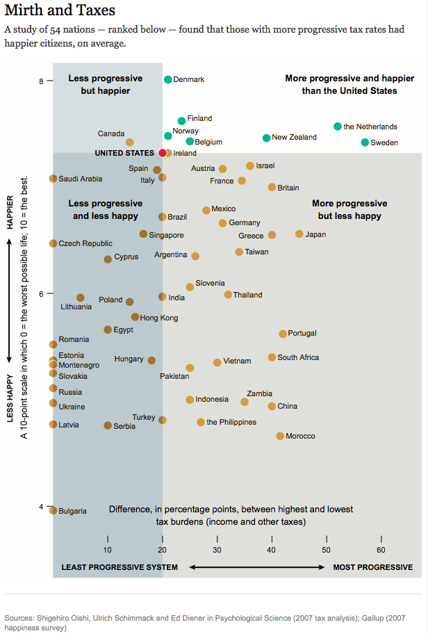
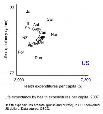
Axis Nice title but dubious message I like to uaeuse declarative titles for charts. This chart below, found
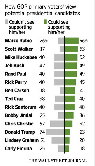
Bar chart But or because more information Wall Street Journal uses this paired bar chart to show the favorable/
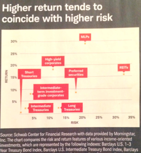
Bumps chart Where a scatter plot fails Found this chart in the magazine that Charles Schwab sends to customers:
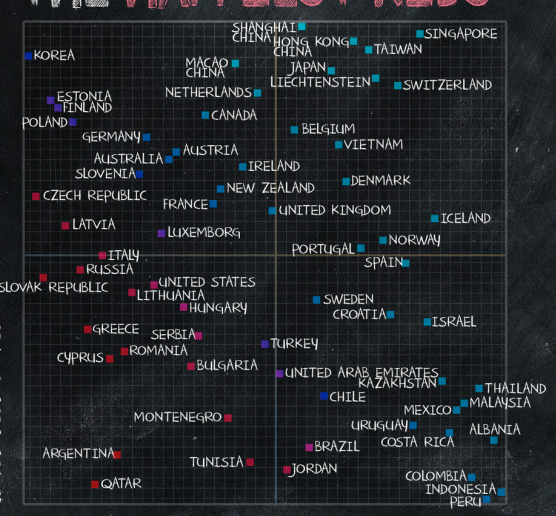
Axis Look what I found: two amazing charts While doing some research for my statistics blog, I came across a