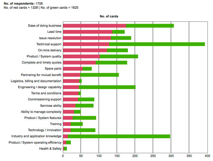
Axis Restoring symmetry, and another survey debunked Reader John G. submitted a chart plus its improvement. Thank you! The
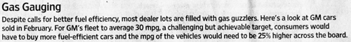
Bar chart An achievable target. And how? The Wall Street Journal tells us that GM car buyers may react
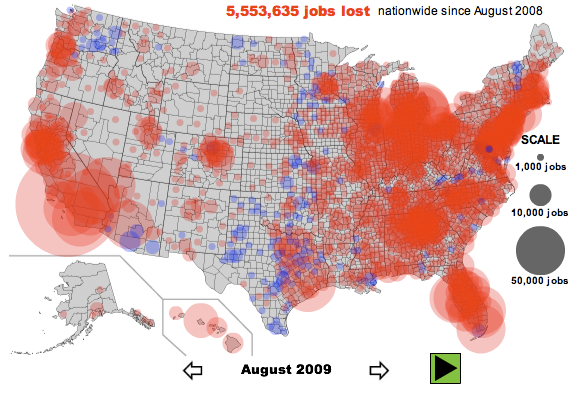
Aggregation Different pictures of unemployment Unemployment and job losses being such a worrying social problem in the
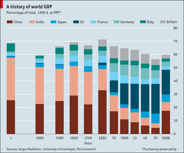
Clustering Energy- and search-efficient At our recent NYU talk, Dona Wong presented a graphic that her