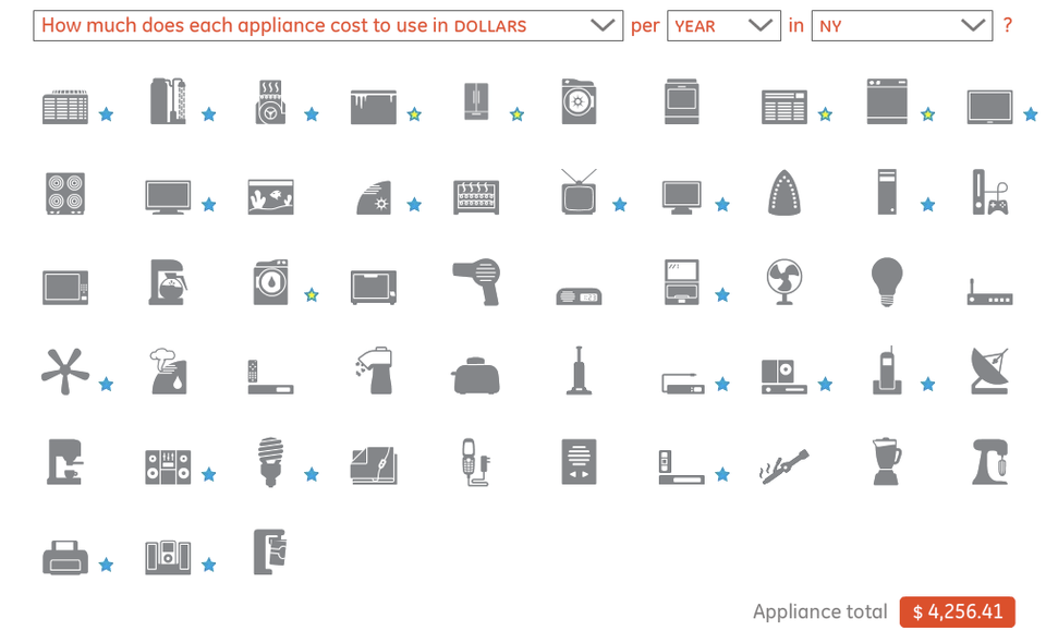
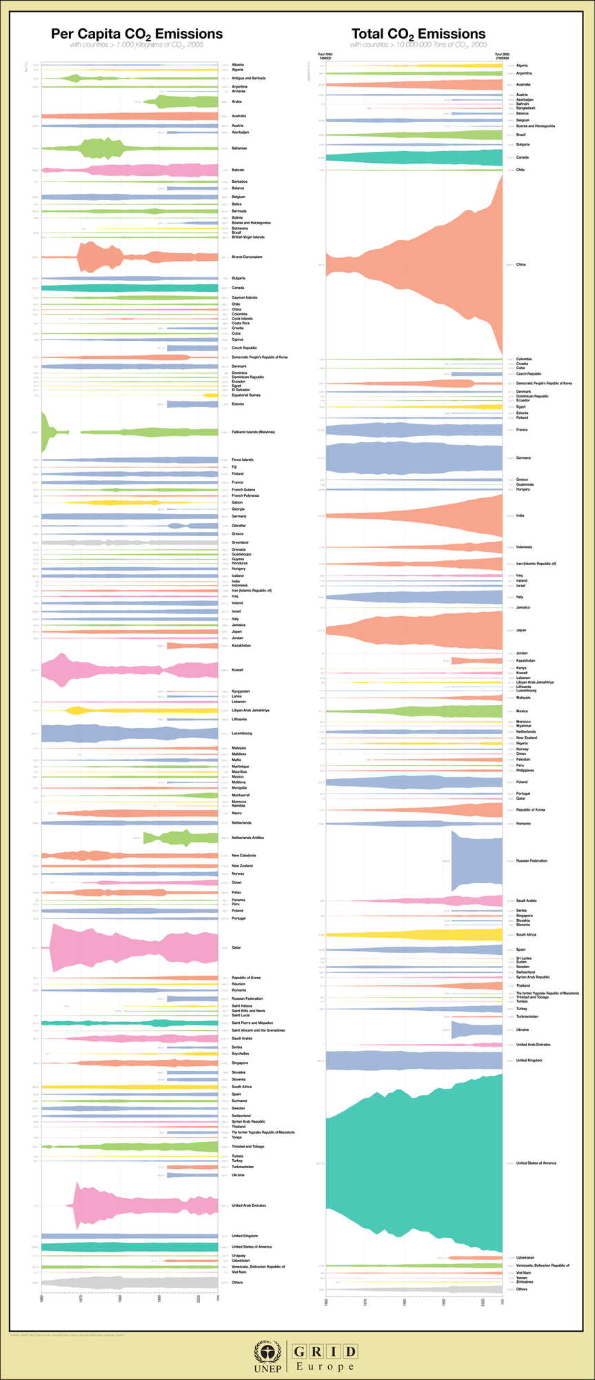
Junk Charts
About
RSS
Posts by Year
Posts by Keywords
Sign in
Subscribe
Sorting
Dot plot
Auditory aid
This effort by the NYT graphics team is breath-taking. They use dot
Area chart
Cousin misfit
Stef, who had a hand in the inkblot charts that many loved,
Blogs
The tweeting crowd
This work by David McCandless, via the Innovations in Newspapers blog, is
Area chart
Leaving ink traces
Stefan S. at the UNEP GEO Data Portal sent me some intriguing
Infographics
Peek into beauty 2
Jeff W made some astute comments on the New York Times Netflix
Aggregation
Spinning multi-color
New York Times has a great pointer to the Global Warming Art
←
Newer Posts
Page 7 of 10
Older Posts
→