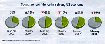
Bar chart Back to basics The holiday weekend permitted me to browse through stacks of unread magazines,
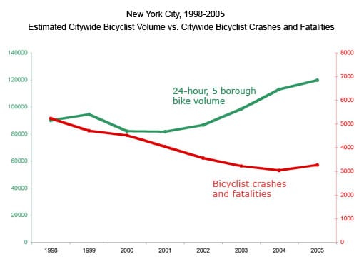
Comparability A matter of timing A reader Carly C. from Streetsblog created the following chart and wanted
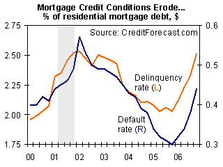
Aggregation Points of comparison In light of the current housing crisis, arising from mortgage defaults, I