Aggregation It's your fault when you use defaults The following chart showed up on my Twitter feed last week. It&
Axis Much more to do after selecting a chart form I sketched out this blog post right before the Superbowl - and
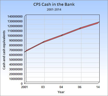
Axis How to print cash, graphically Twitter user @glennrice called out a "journalist" for producing the
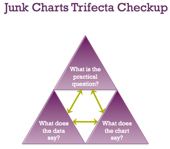
trifecta checkup Junk Charts Trifecta Checkup: The Definitive Guide Kaiser Fung, from Junk Charts, explains the data visualization framework known as the Trifecta Checkup, used to conceptualize and critique data graphics and charts.