Tell me what makes you mad
Kaiser asks what's wrong with this dataset
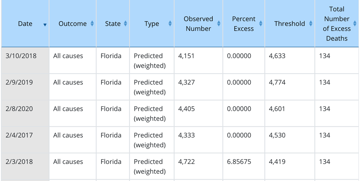
If you're a data analyst reading this blog, take a look at the following data table, and tell me what annoys you most about it.
I came across this table when researching mortality statistics for the U.S. The CDC has this labyrinth of a website, which apparently trick all the search engines so it took me a long time to land on this page. It supposedly contains weekly mortality numbers for the State of Florida; a "threshold" which is the upper bound of a projection using a model; and excess deaths defined as the difference between the observed deaths and the projected deaths.

(If you want a hint to find issue #1, start with how this table is supposedly sorted.)
For extra credit, this next section of the table reveals more problems:

***
For people managing data analysts, this is why even simple things may take forever! Most data come with traps and potholes that must be dealt with before anything can get done. This example is structured data (in tabular form). If the data come as "unstructured", the issues multiply.