The climate chart that sparks a count v ratio debate
Also the null hypothesis
Long-time reader Chris P. alerted me to a debate over climate graphs between Aaron Brown and Hank Green who have each recorded youtubes stating their positions (Brown and Green).
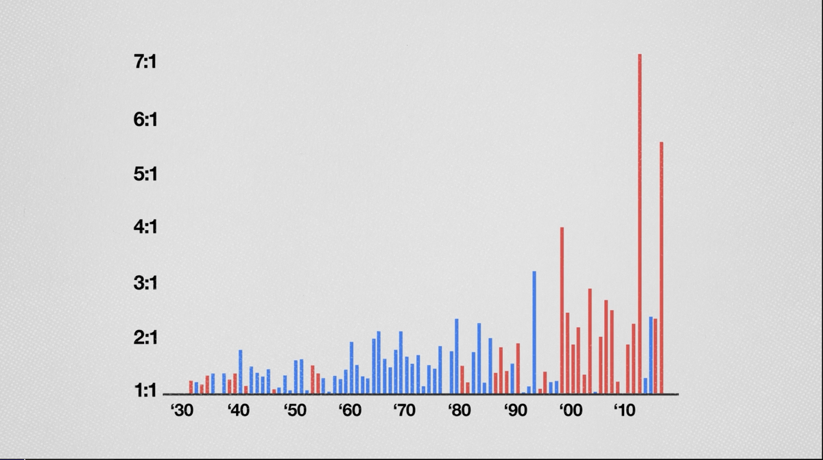
One of these charts (shown above) actually defines an unusual way of measuring climate change. It originally came from the official Climate Change Special Report of 2017 (Figure 6.5, also reproduced as Figure ES.5).
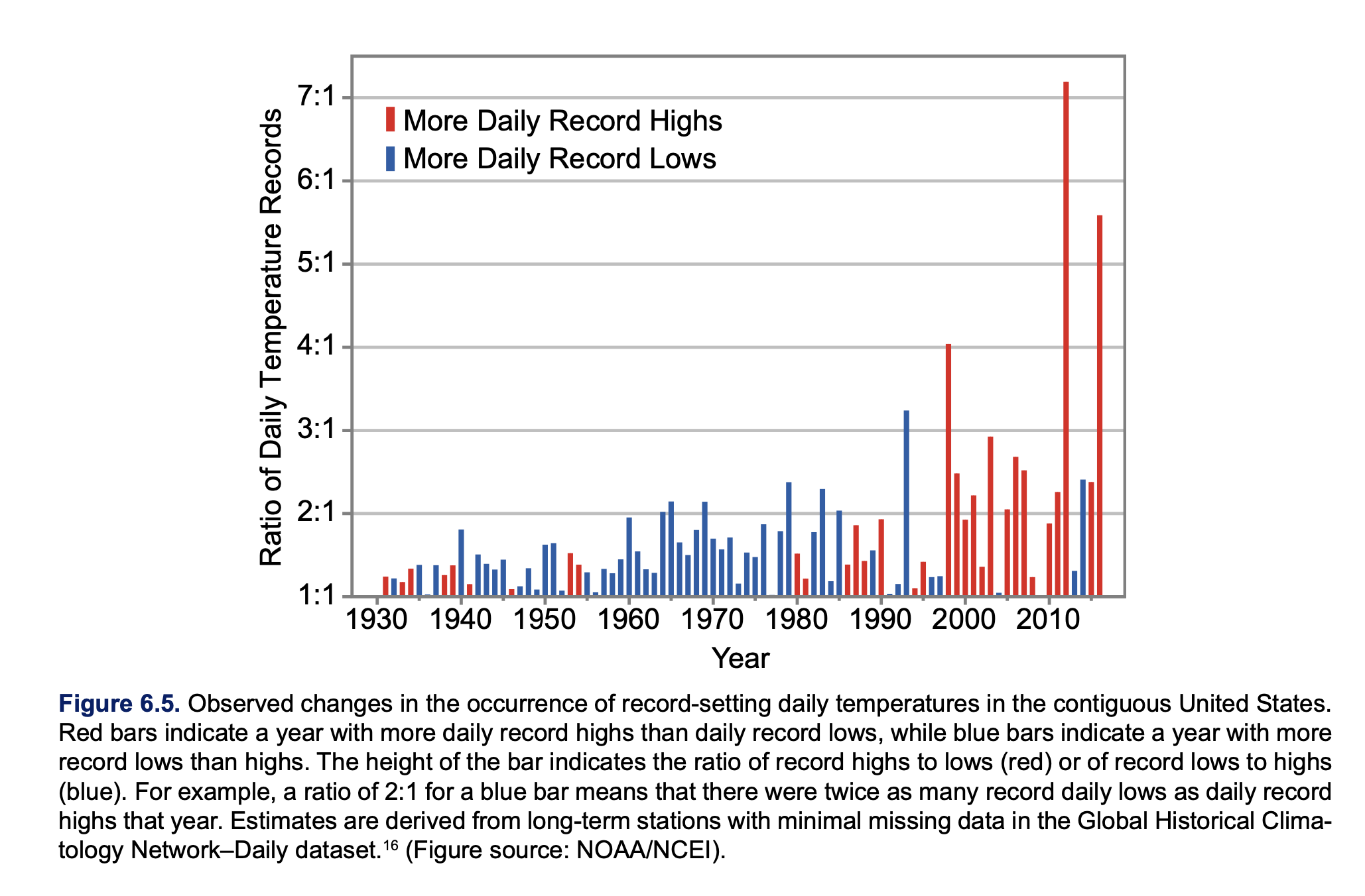
This chart shows red and blue bars over time, between 1930 and 2016. The key ingredients are days in which the temperature reached record high or low. The bar is red for years in which the number of record highs exceeded the number of record lows; the bar height is the number of record highs per number of record lows. On the other hand, if the count of record lows is higher, then the bar is blue, and its height is the ratio of record low to record high.
The climate scientists are concerned about the increasing trend in the number of red bars, as well as the height of red bars. This suggests that the earth is getting warmer. The iconic “hockey stick” graph (which also features in those videos) measures the average (excess) temperature, while this chart focuses on the extremes of temperature.
Brown alleges that the use of ratios is manipulative while Green defends it as smart. In this post, I show why using ratios is beneficial, and not problematic for this chart. In a follow-up post, I’ll consider meaningful issues with the chart.
On one level, Brown’s argument is sensible. By showing ratios, rather than the counts, the chart obscures the fact that the number of new records has been decreasing over time. Here is what Brown, citing Steven Koonin’s book, says the counts look like:
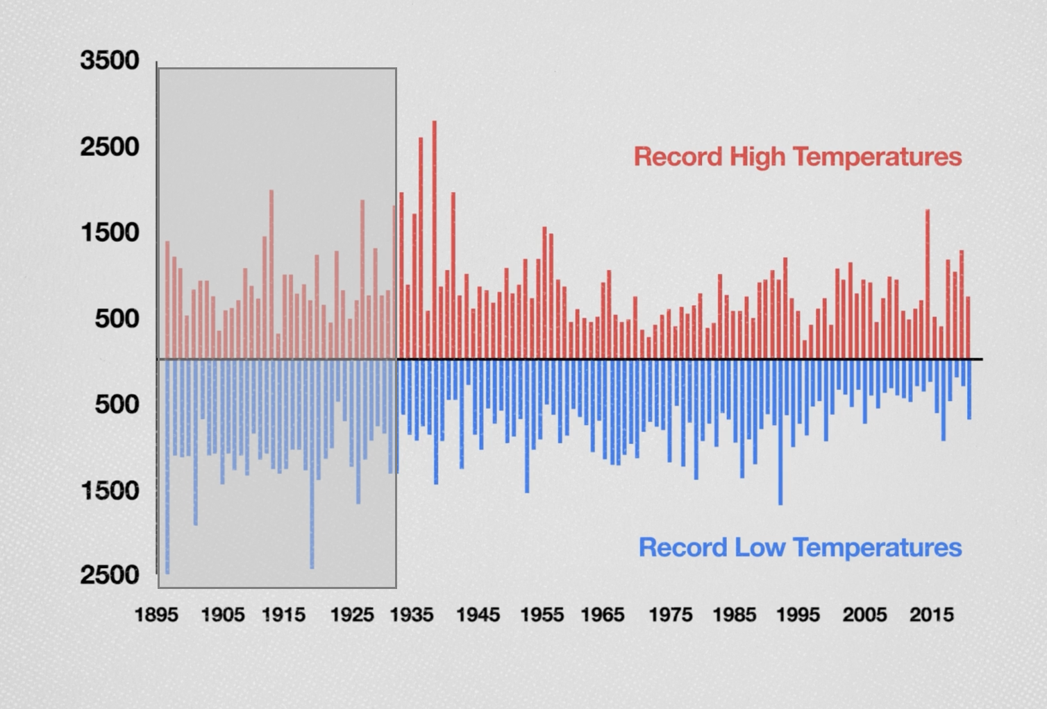
I grayed out the front part of the chart as they concern years that didn’t show up in the original chart. Brown charges:
The only reason to present the data as a ratio is to create a scary visual in which the alarming-looking red lines get taller and taller.
It’s quite possible climate scientists want to show “alarming-looking” graphics. Brown is also right in observing that (a) the absolute number of record highs is not growing (he calls it “holding steady”); and that (b) the ratios are getting larger, primarily because the number of record lows is decreasing.
A paragraph later, Brown serves up his own counter-argument.
In the early years, there were many warmest and coldest days because it's easy to set records over short time spans. By 2018, a day had to be the warmest or coldest in 124 years to count, so record days occurred less frequently.
In other words, both record highs and record lows are expected to wither away over time; the further out we go, the harder it is to make a new record. Therefore, if the frequency of record highs is falling, it doesn’t negate global warming, and neither does record lows becoming rarer prove global warming.
Therein lies a challenge of interpreting this chart. The analysis needs a “baseline”. We have to establish what the metric looks like without climate change. Then, if we observe something different from that baseline, we can investigate the reasons for the differences.
The official graphic in the climate report also suffers for the lack of a baseline. They just point to the increasing ratio and suggest that it is consistent with global warming. Left unspoken is the important idea that without climate change, we expect the ratio to settle around 1.
I just mentioned a reason for adopting the ratio metric – it has a recognizable baseline. By symmetry, the trend of attaining record highs should mirror the trend of attaining record lows. Both counts, as we’ve argued, should be decreasing but in a similar way – in the absence of climate change. Thus, the ratio should hug close to 1 (the rest is noise).
This is also the gist of Green’s retort to Brown’s criticism.
It turns out that we can be more precise about the trends of counts of record highs and lows as the years pass by but they would look like curves, not straight lines. We’d have to monitor two curves. This is a good example in which we can construct a “ladder of abstraction” (See my paper with Andrew Gelman here). It’s important for readers to know the composition of the ratio – in this regard, I agree with Brown.
Let’s now make the above statements precise.
We want to nail down the baseline scenario of no climate change (In classical statistics, we call this the null hypothesis.)
Let’s zoom in on a single measurement station. We imagine that the daily temperatures follow a fixed distribution (for concreteness, one can imagine a normal distribution with mean \(\mu\) and standard deviation \(\sigma\)). When the climate is stable, we assume that each day, we take independent draws from the same distribution.
Consider record highs. Each new measurement is either a new record high or not. The probability that the measurement at time t is a new record high is \(\frac{1}{t}\). That’s because each measurement up to time t has equal chance of being the current record.
Start with the first measurement, which is trivially a record high. With two measurements, the second number has equal chance of being higher or lower than the first number. This follows from symmetry induced by the iid assumption. With three measurements, again each one has equal chance (\(\frac{1}{3}\)) of being the record high, thus the probability that the third one is a new record is \(\frac{1}{3}\). This quantifies the idea that it’s harder and harder to break records over time.
The expected number of records up to time t is the partial sum of the harmonic series, \[1 + \frac{1}{2} + \frac{1}{3} +....+\frac{1}{t},\] which is approximately \(\log{t}\). Note that the slope of \(\log{t}\) is \(\frac{1}{t}\).
If we have \(n\) stations emitting \(n\) streams of measurements, then the expected number of records up to time t is \(n \log{t}\).
We would then want to put a confidence bound around that number and if the observed number of record highs strays outside the confidence bound, then we have evidence that the climate is not stable.
Since the value \(n \log{t}\) increases with both \(n\) and \(t\), it is not easy to work with.
Instead, we consider the trend of record lows as well. Using the same argument, we’ll find that the probability that the measurement at time t is a record low is also \(\frac{1}{t}\); the expected number of record lows up to time t is \(\log{t}\) for a single station, and \(n \log{t}\) for \(n\) stations.
Thus, if we take the ratio of record highs to record lows, the expected value is 1. Of course, because of randomness, at any time t, the ratio would not be exactly 1. It should be close, and again, it’s the confidence bound around the ratio that describes how far it might deviate from 1.
This calculation can be further refined as I made another simplifying assumption, namely, that there is a fixed number of stations collecting data, and they were all deployed at the same time.
As the decaying probability of new records indicates, stations with a shorter history have a disproportionately larger impact on the number of record highs and lows. Brown argues that such recency bias is a reason to ditch using ratios. His diagnosis is correct but the treatment wrong-headed. The bias manifests itself absolutely in the counts. If we use the ratio of highs to lows, then the bias gets cancelled out.
The use of the ratio isn't a problem. There are other issues with the chart. I'll discuss those in another post.