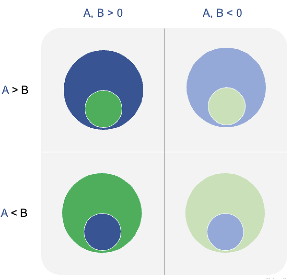
The "data" corner of the Trifecta
Why spider charts fail, from a Trifecta Checkup perspective
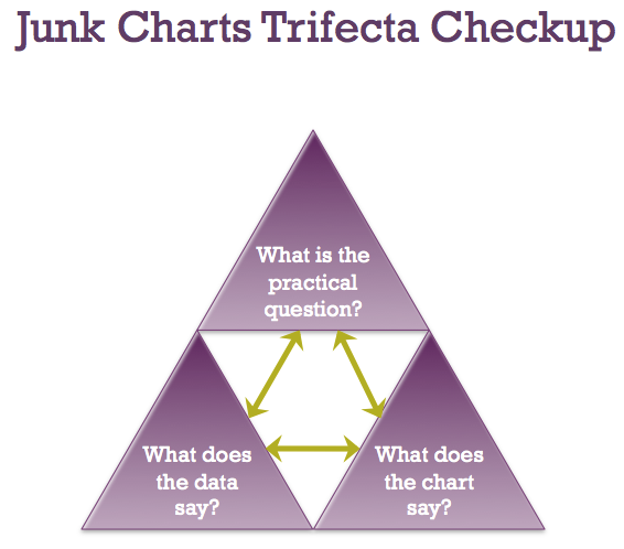
In the JunkCharts Trifecta checkup, we reserve a corner for "data". The data used in a chart must be in harmony with the question being addressed, as well as the chart type being selected. When people think about data, they often think cleaning the data, processing the data but what comes before that is collecting the data -- specifically, collecting data that directly address the question at hand.
Our previous post on the smartphone app crashes focused on why the data was not trustworthy. The same problem plagues this "spider chart", submitted by Marcus R. (link to chart here)

Despite the title, it is impossible to tell how QlikView is "first" among these brands. In fact, with several shades of blue, I find it hard to even figure out which part refers to QlikView.
The (radial) axis is also a great mystery because it has labels (0, 0.5, 1, 1.5). I have never seen surveys with such a scale.
The symmetry of this chart is its downfall. These "business intelligence" software are ranked along 10 dimensions. There may not be a single decision-maker who would assign equal weight to each of these criteria. It's hard to imagine that "project length" is equally important as "product quality", for example.
Take one step backwards. This data came from responders to a survey (link). There is very little information about the composition of the responders. Are they asked to rate all 10 products along 10 dimensions? Do they only rate the products they are familiar with? Or only the products they actively use? If the latter, how are responses for different products calibrated so that a 1 rating from QlikView users equals a 1 rating from MicroStrategy users? Given that each of these products have broad but not completely overlapping coverage, and users typically deploy only a part of the solution, how does the analysis address for the selection bias?
***
The "spider chart" is, unfortunately, most often associated with Florence Nightingale, who created the following chart:

This chart isn't my cup of tea either.
***
Also note that the spider chart has so much over-plotting that it is impossible to retrieve the underlying data.