The line-angle illusion
We fail to judge the distance between two lines on a chart.
In a recent presentation, Prof. Matthias Schonlau explains his "hammock plot." I wrote about it here. During the talk, he used the hammock plot to illustrate an optical illusion found in plots requiring users to compare angular lines, known as the line-angle illusion. (Others prefer the name "sine" illusion.)
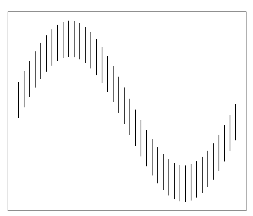
Here is a simple demonstration of the line-angle illusion, extracted from this paper.

Think of the two sine curves as time series, and we're comparing the differences between them. This requires us to assess trend in the vertical distances between the two lines. Weirdly, we perceive the vertical lines on the above chart to have varying lengths, even though they have equal lengths.
***
The link here contains an example of how the line-angle illusion can lead to misreading of trends on line charts:

Is there a bigger difference in revenue at Time 1 than Time 2? Many of us will think so but on careful judgment, I think all of us can agree that the difference at Time 2 is in fact larger.
***
Much of the interest in a hammock plot lies in the links between the vertical blocks, and this is where the line-angle illustion can distort our perception. Studies have shown that humans tend to read not the vertical gaps but the angular gaps. Again, this issue is illustrated in the first mentioned paper:

Matthias explained that their implementation of the hammock plot uses a strategy to counteract this line-angle illusion.
I take this to mean they distort the data in such a way that after readers apply the line-angle illusion, the resulting view would convey correctly the correct trend. A kind of double negative strategy. The paper linked above offers one such counter-illusion strategy.
I imagine this is a bit controversial as we are introducing deliberate distortion to counteract an expected perceptual illusion.
I'm not aware of any software that offers built-in functions that perform this type of illusion-busting adjustments. Do you know any?
P.S. [5-30-2025] Andrew Gelman has some comments on this topic on his blog. He said:
But to get closer to what Kaiser is asking: the analogy I’ve given is, suppose you’re building a wooden chair but using boards that are warped. In this case, the right thing to do is to incorporate the warp into the design, i.e. cut some pieces shorter than others and at different angles, etc., so that they fit together as is, rather than trying to go all rectilinear and then glue/nail everything together. The trouble with the latter strategy is that the wood will exert pressure on the joints and eventually the chair will break or distort itself in some way.


