The paradox of circles
You can't have it both ways, no you can't

While I was writing the posts about making paired circle charts (here, here), I came across a paradox.
The oft-repeated guidance when making circles or bubbles is that the data should be encoded in the areas. Since circular areas involve squaring the radii, we should square-root the data if we're putting the data in the radius (or diameter). This action happens frequently because in most drawing programs, we can control the radius (or diameter) easily, but we can't directly calibrate the area.
Now, take a look at the following chart:

I dislike these racetrack charts (link). Anyone who has run on a track knows the outer lanes are longer than the inner lanes. These charts draw our attention to the circumferences of the circles.
Therein lies the rub. The circumference is proportional to the radius (or diameter). Therefore, if we make an emptied-out circle, we should not square-root the data.
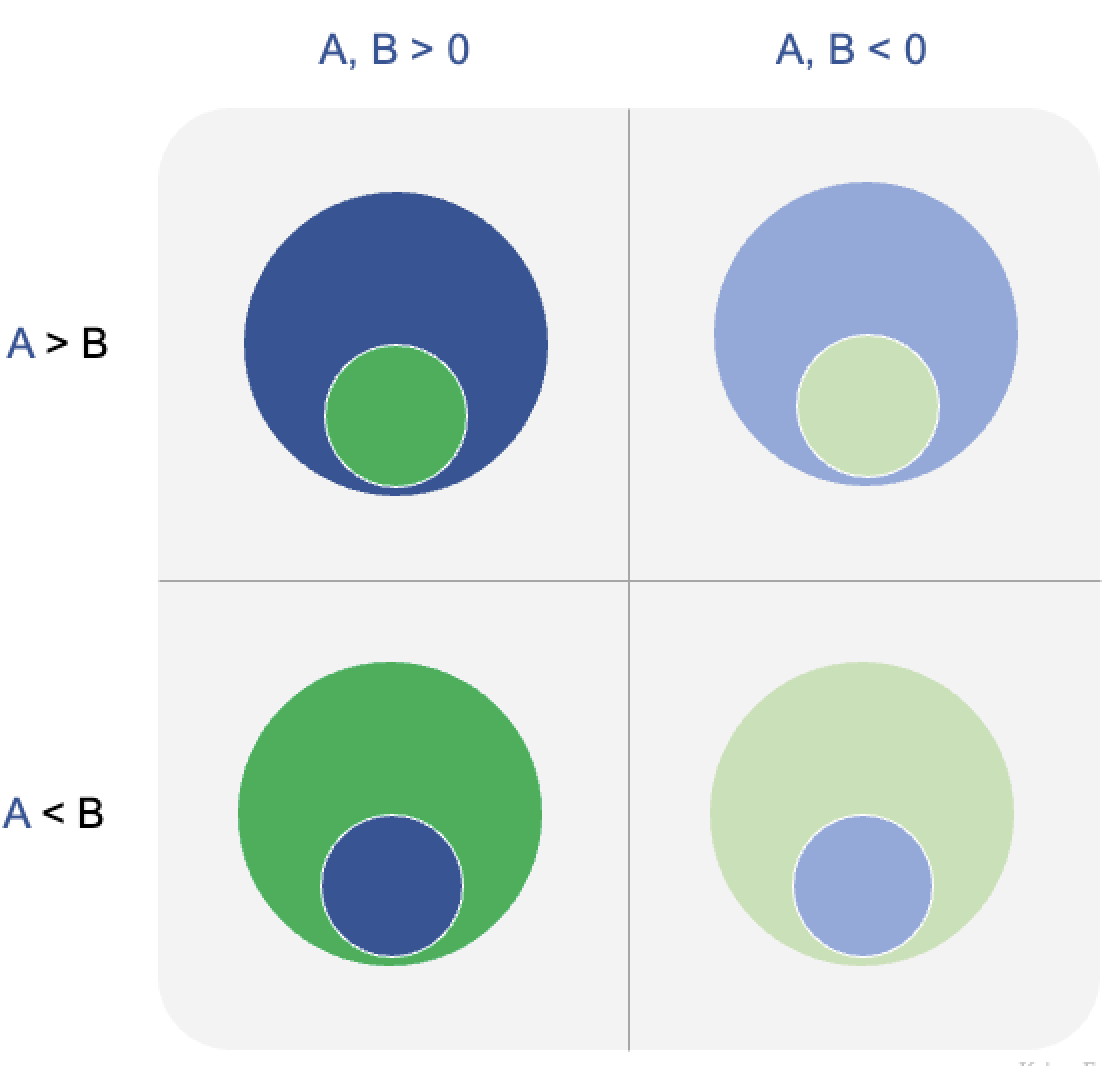
The trouble is in every circle, the area and the circumference (or border) are simultaneously present. Hence, the paradox of circles. If the data are attached to the area, then the circumference distorts them; if the data are tied to the circumference (or radius or diameter or angle), then the area distorts it. One can't have both!
I asked Andrew about this paradox, and of course, he has written something related to it. It's in this post, which was a response to an earlier post of mine (link).
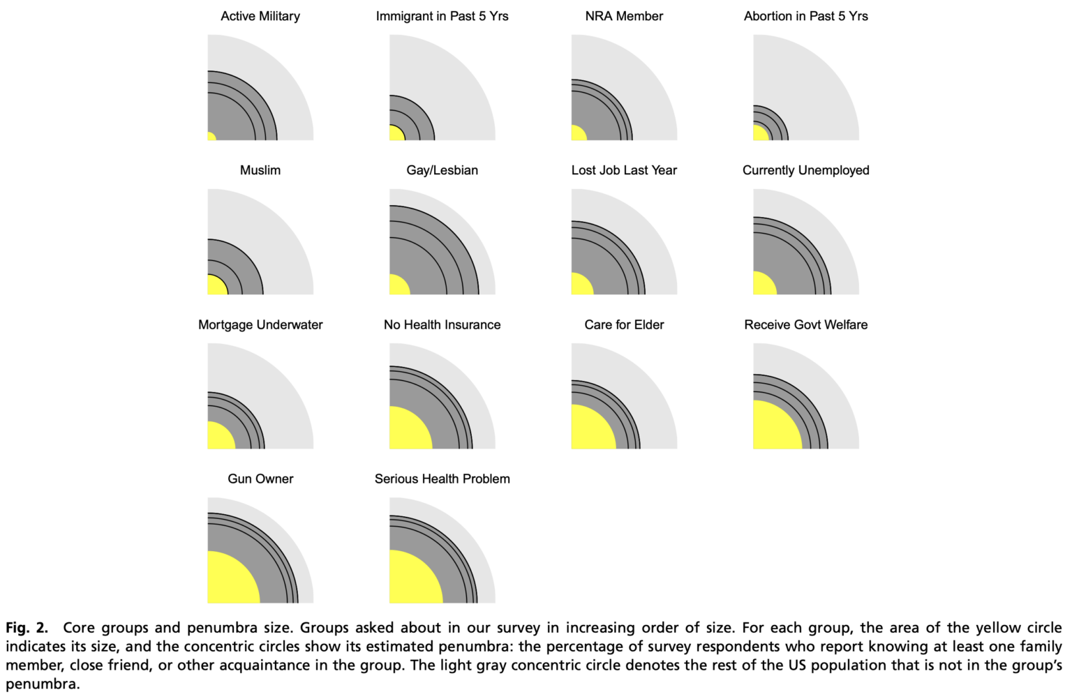
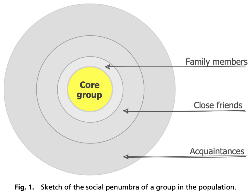
Andrew featured the following chart he made about the "social penumbra" of different groups of people:
He ran into the neither here nor there problem, saying:
So by displaying the data as areas, we’re knowingly handing people a distortion. For example, if a certain group represents 1% of the population, then the core group (the yellow circle in the graph) will take up 1% of the area of the full circle and thus will be 10% in linear dimension.
Instead of full circles, he made quarter-circles. I think it's a brilliant move. The other three-quarters are just wasted space, so to speak. However, because the right-angled edges are present, the readers may be more likely to pay attention to the radius of the quarter-circle, rather than its area.
For what it's worth, this is the legend:
Let's zoom in on the "gun owner" category at the bottom left corner:
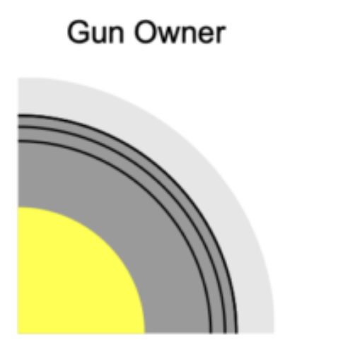
The first gray circle ("family members") has a radius that is about 1.5 times that of the yellow "core". If the data are encoded in the circular areas, then the gray circle's area is \((1.5)^2 = 2.25\) times that of the yellow "core". So, the size of family members but not core is 1.25 times the size of the core.
On the other hand, if the data are encoded in the radii, then the gray circle (think its circumference) is 1.5 times that of the yellow circle, so that the set of family members (not core) is about half the size of the core.
Thus, the "distorted" quantity is quite severely distorted. As a designer, you're hoping that your readers interpret the chart the way you intended (one of area or circumference, but not both).
In this case, I would be surprised if readers are focused on the circumferences. They might try to measure the radii since that's much easier to compare than the areas. (This is still true if the full concentric circles are shown.) On balance, I still think these quarter-circles have a place in our toolbox.
In the older post, I asked whether designers should (be forgiven for?) deliberately distort data in order to correct known visual illusions.
The quarter-circle example is related but not quite what I had in mind. This paradox of circles is such that we are forced to distort one quantity no matter what; so we aren't really doing a double-negative to undo an illusion.
The log chart is also related but not quite what I had in mind. In a log chart, we deliberately introduce a severe distortion, and it's not because readers apply an illusion to undo its effect.